


ONLINE SHOP


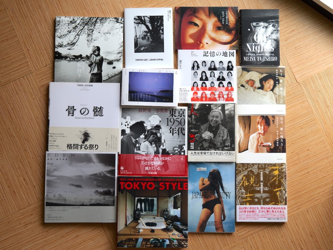
What do these photobooks have in common?
トップの写真をご覧ください。早速ですが、これらの写真集の共通点はなんでしょうか?
They each feature one of my favorite elements of Japanese photobook design: the inclusion of additional pictures hidden under their dust jackets.
これらにはすべて、私が気に入っているデザイン技術が施されています。それはカバーの下に、隠された写真があるということです。
There are two things I especially like about this.
The first is how this design trick rewards a reader’s curiosity. It’s a bonus revealed only by “unnecessary” interaction in the photobook as an object. It’s sort of like an extra song tucked in at the end of an album on CD- these cover pictures are like the hidden tracks of photobooks.
私が特に気に入っている点は2つあります。
1つ目は、このデザイン・トリックが読者の好奇心に対してどのように作用しているのかということです。写真集という物質だからこそ可能であるこの仕掛けは、CDアルバムの最後におまけとして挿入されている「ボーナストラック」のようなものです。
The second reason is that there’s a slightly “wasteful” aspect to it. There’s something wonderful in how it so subtly and stylishly subverts expectations of a “practical” idea of what a book of photographs is. When making a photobook the focus is on a book’s theme, sequence, and print quality, among a myriad of other choices. Why put in further time and effort and expense into something that most people won’t ever think to look at?
But that’s EXACTLY what makes it so cool. Like I said, it’s a reward.
2つ目は少し「無駄」であるという側面です。
写真集を作る場合、無数の選択肢の中から選んだ本のテーマや、写真の並び順、印刷の質などに焦点が当てられます。ほとんどの人が見ようと思わないカバー下の「隠し写真」のために、なぜ時間と労力、費用をかけるのか?それこそがカッコいいんです。写真集とは何かという実用的な考えに対する期待を、さりげなく、スタイリッシュに覆してしまうところに素晴らしい魅力があるように感じませんか?
I’m curious how this idea might be connected to other aspects of Japanese visual culture- perhaps an echo to things like the intricately decorated inner layers of kimono that won’t be seen by anyone but the wearer- or exquisite private gardens kept behind plain earthen walls.
Aesthetic cultural legacy, or the whims of a graphic designer? A photographer wanting to squeeze in as many photos as possible?
Either way, allow me to share a few photobooks from my shelves that offer more than first glance suggests.
カバー下のデザインというものが、日本におけるさまざまな視覚文化と結びついているように感じられ、興味深いです。例えば、着物の内側に施された、着る人以外には見えない複雑な装飾。また、立派なお家の塀の内側に造られる箱庭にも通ずるところがあります。
今回は私の本棚からセレクトした、一見する以上の印象を与えてくれる写真集を何冊かご紹介します。
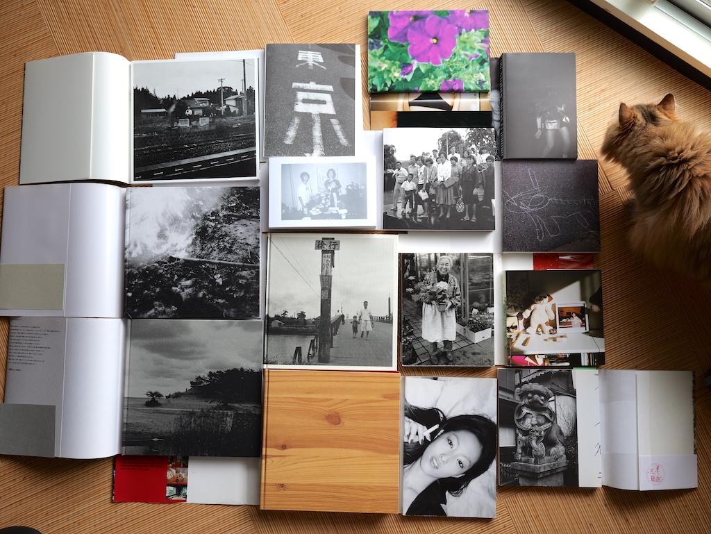
First off, four designed by Hitoshi Suzuki.
Suzuki, who passed away in 2023, was one of my favorite book designers. He often tucked photos under dust jackets like this.
まずはデザイナーである鈴木一誌さんが手がけた4冊です。
2023年に他界した鈴木さんは、私の好きなブックデザイナーの一人でした。鈴木さんはカバー下に写真をレイアウトすることが多かったように思います。
- 1. Masato Seto, Maps of Memory, (Nippon Camera, 2020)
- 瀬戸正人『記憶の地図』日本カメラ社、2020年
- 2. Keijiro Kai, Down to the Bone, (Koyosha, 2020)
- 甲斐啓二郎『骨の髄』新宿書房、2020年
- 3. Shigeichi Nagano, Tokyo in the 1950s, (Iwanami, 2007)
- 長野重一『東京1950年代』岩波書店、2007年
- 4. Issei Suda, EDEN, (Place M, 2020)
- 須田一政『EDEN』Place M、2020年
- ※From top left, clockwise(左上から時計回り)
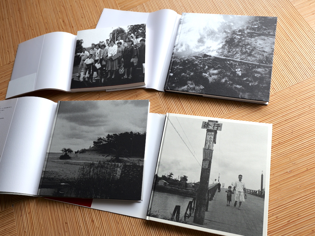
Flipping the books over, these images are revealed:
本を裏返すと、これらの写真が現れます。
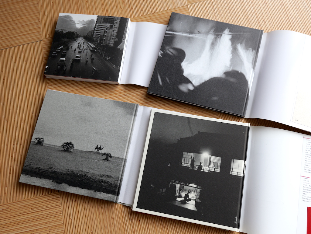
It might not come across in these images on this website, but the rear photo of each seems, certainly compared to the front and the pictures inside, “quieter” in tone. A soft way to (literally) close a photobook.
上の画像では伝わりにくいかもしれませんが、それぞれの写真は、表紙や写真集の中身とくらべると「静か」な雰囲気が漂っています。
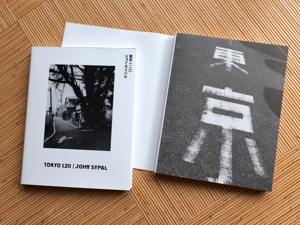
- 5. John Sypal, Tokyo120, (Self-publishing, 2024)
- ジョン・サイパル『東京一ニ〇』私家版、2024年
This element, perhaps most common in the 1990’s & 2000’s, was something I wanted to include with my book, Tokyo 120. Working with designer Yoichi Yamada, the book’s front cover features a photo of a stretch of pavement with the characters “Tokyo”. (A literal “street” photograph.)
While it has a strong visual impact, I felt this image was too straightforward to use on the dust jacket itself. Covering it up just a bit like this felt appropriate.
自分の写真集で申し訳ありませんが、今年自費出版した『東京一二〇』を紹介させてください。
デザインの要素として、この形は個人的にも好きな1990年代〜2000年代にかけて最も一般的だったものです。デザイナーの山田洋一さんと話し合いながら、カバーの下に「東京」という文字が入った舗道の写真をレイアウトしました(文字通りの「ストリート」写真です)。この写真は視覚的なインパクトが強く、表紙そのものに使うにはストレートすぎると感じたため、このように少し隠すことにしました。
Next up-
This is the cover of Nobuyoshi Araki’s Tokyo Kannon:
次は荒木経惟さんの写真集『東京観音』です。
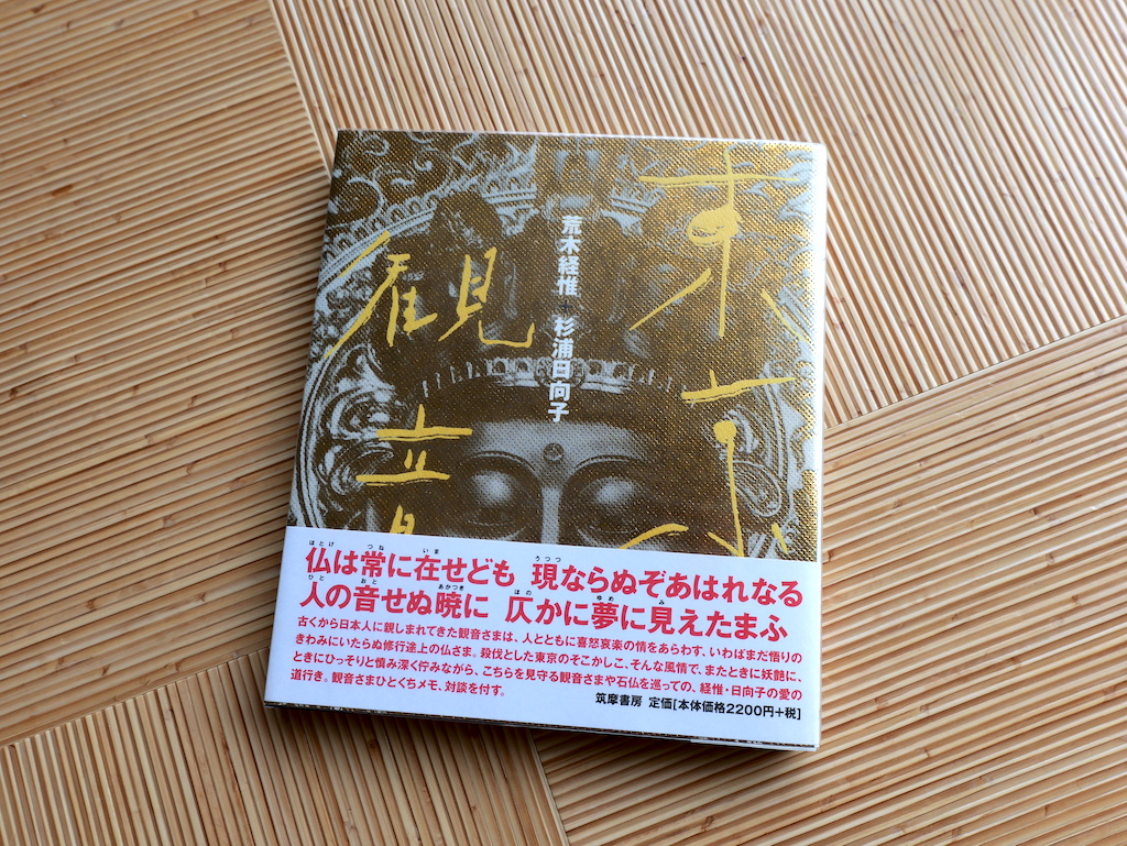
- 6. Nobuyoshi Araki & Hinako Sugiura, Tokyo Kannon, (Chikuma Shobo, 1998)
- 荒木経惟・杉浦日向子『東京観音』筑摩書房、1998年
Published 1998 by Chikuma Shobo, it collects Araki’s photos of Buddhist statuary taken on Tokyo temple visits with writer Hinako Suguira. This is a beautifully designed book and the gold-leaf-like paper on the cover references both Buddhist decorative elements in general and the photograph’s subject in particular: the face of the six-meter tall, golden Buddha of Kogen-ji temple in Bunkyo ward.
1998年に筑摩書房社から出版されたこの写真集は、荒木経惟さんが作家の杉浦日向子さんとともに、東京の寺院を訪れた撮影した仏像の写真を集めたものです。表紙の金箔風の紙は、仏教装飾全般と、写真の被写体である文京区にある光源寺の高さ6メートルの金色の仏像の顔を表現しています。
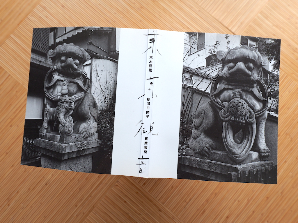
For a book about statues of Buddhas it’s fitting- and clever- that the book is “protected” on either end by a pair of Komainu, the guardian lion-dog statues that are found aside the entrances to Buddhist temples.
カバーを外すと…。仏像の写真集として、本の両端が一対の狛犬によって守られているのはぴったりです。私の大好物です!
- 7. Meisa Fujishiro, Now, I Go Home, (Rockin’ On, 2004)
- 藤代冥砂『もう、家に帰ろう』ロッキング・オン、2004年
- 8. Meisa Fujishiro, Now, I Go Home 2, (Rockin’ On, 2011)
- 藤代冥砂『もう、家に帰ろう 2』ロッキング・オン、2011年
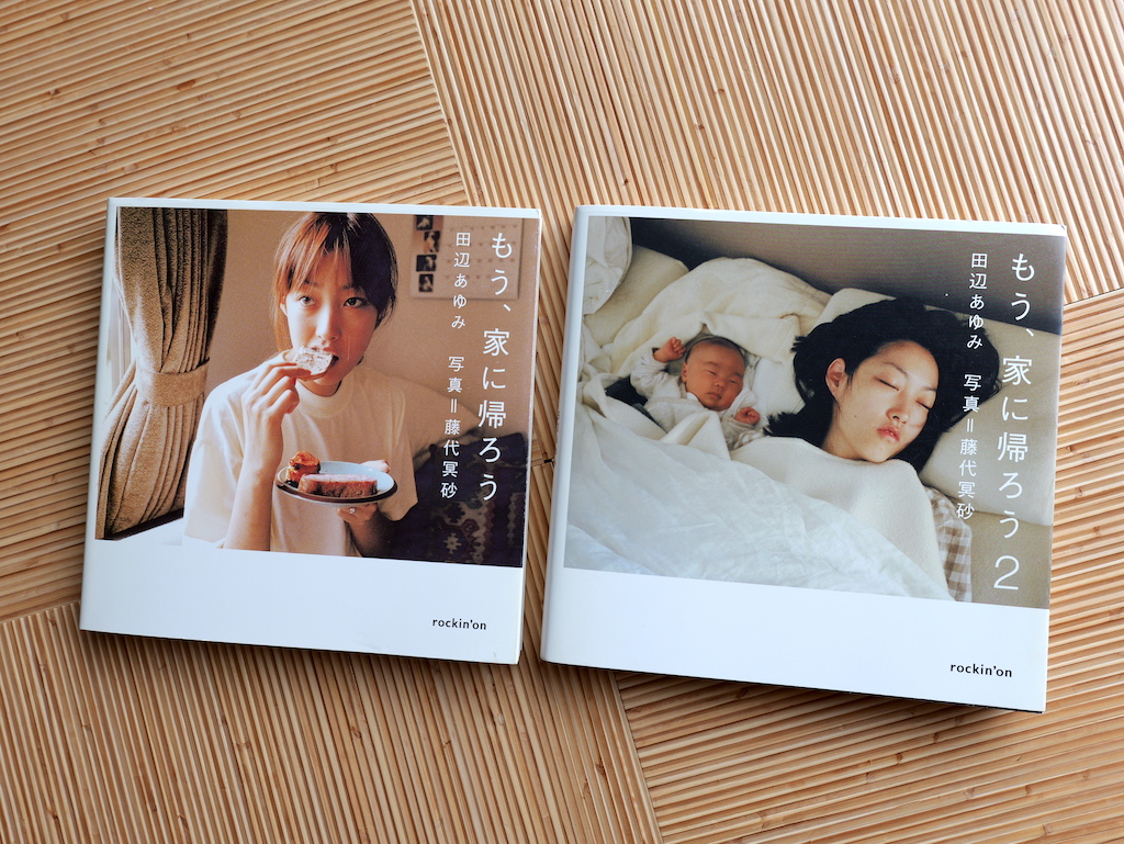
These are the covers of Meisa Fujishiro’s charming domestic diary, “Now, I Go Home”:
これは写真家・藤代冥砂さんの愛が溢れいてる日記『もう、家にかえろう』シリーズの表紙です。
The first entry is on the left. It focuses on the early years with his wife, Ayumi Tanabe. The sequel lovingly celebrates & documents the birth of their son and new life as a young family. Under the dust jackets, their front covers are a domestic still life (1), and a sidewalk chalk drawing by his son (2).
1冊目(左)は妻・田辺あゆみとの結婚初期に焦点を当てています。続編では息子が誕生し、家族としての新生活を愛情たっぷりに祝福&記録しています。
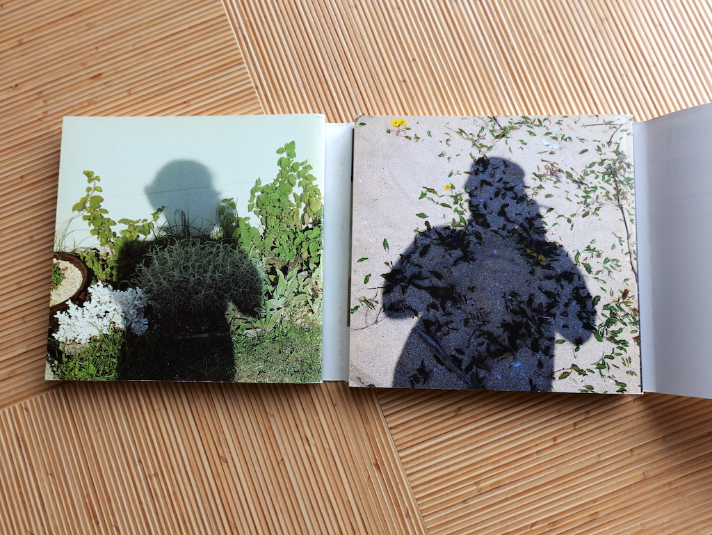
While Fujishiro’s presence is felt throughout the books’ photographs and captions, on the rear covers it is more clearly given shape:
To me the inclusion of his shadow at the end is reminiscent of the untold-millions of snapshots fathers around the world have taken over the past hundred-plus years… sun on their back, their lives before their lenses. It says just enough.
写真集でまとめられている写真やキャプションを通して、撮影者である藤代さんの存在を感じることができるのですが、カバーをめくると、よりはっきりと形になっています。この影が入ることは、過去100年以上にわたって世界中の父親たちが撮ってきた、数え切れないほどのスナップショットを彷彿とさせます。カバーの下はこのようなものが「ちょうどいい」です。
Here is a West/East comparison involving books by the photographer, Hiromix.
それでは、HIROMIXさんの写真集から「西」と「東」のデザインをくらべてみましょう。
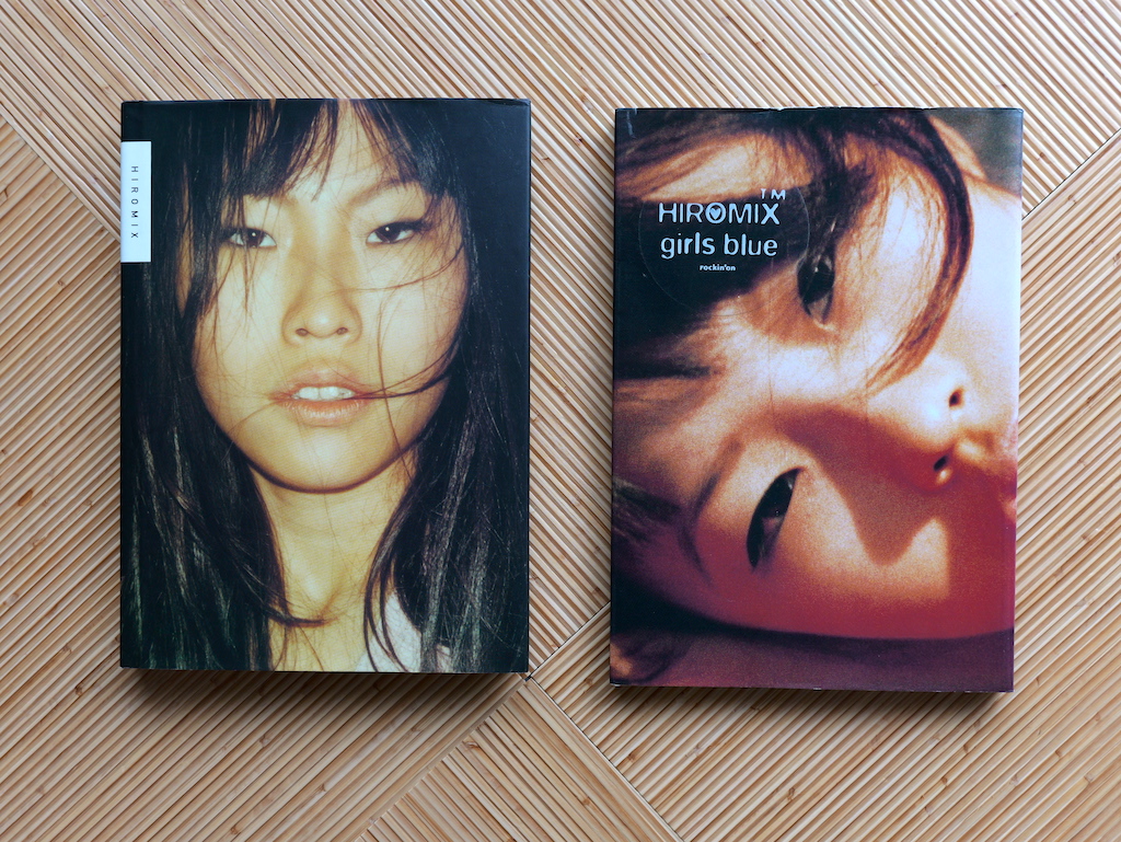
- 9. HIROMIX, HIROMIX, (Steidl, 1998)
- HIROMIX『HIROMIX』Steidl、1998年
- 10. HIROMIX, girls blue, (Rockin' On, 1996)
- HIROMIX『girls blue』ロッキング・オン、1996年
On the right is “Girls Blue”, her landmark photobook published by the Japanese music magazine Rockin’ On in 1996. On the left is “HIROMIX”, a 1998 collection of her photos by the renowned German publisher Steidl. Both covers feature a close-up of the photographer, her striking eyes inviting the reader to see the world through her eyes, er, lens.
右は1996年にロッキング・オンから出版された画期的な写真集『girls blue』、左は1998年にドイツの有名出版社Steidlから出版された『HIROMIX』です。どちらの表紙も写真家のクローズアップが特徴で、HIROMIXさんの印象的な瞳が際立っています。彼女の「目」、レンズを通して世界を見るように読者を誘っています。
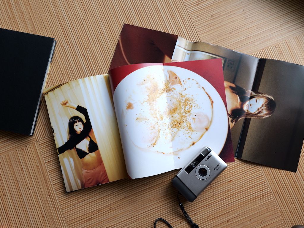
A B5 softcover, every single surface in Girls Blue is awash in raucous, youthful color. There are photos everywhere, and the book’s inner covers fold out reveal even more snapshots. The construction is simple, but clever, with semi-gloss paper stock that evokes the vibe of a fashion magazine. The dust jacket can be removed and be displayed as reversible poster- a closeup of the photographer on the front, and a full-body Hiromix self-portrait on the inside. Everything about this book hums with 1990’s pre-internet innocence and 1-hour photo labs.
It’s vivid, cheeky, and most importantly, fun.
B5判ソフトカバーの『girls blue』は一面すべてが若々しく賑やかな色彩に溢れています。いたるところに写真があり、本の内表紙を折りたたむとさらに写真が現れます。作りはシンプルですが巧妙で、ファッション誌の雰囲気を思わせる半光沢の紙を使っています。ブックカバーは取り外すことができ、表は写真家本人のクローズアップ、裏は全身が写ったセルフポートレートと、リバーシブルのポスターになっています。
この本のすべてが、1990年代の「インターネット時代以前」の無邪気さとフジカラーラボの雰囲気を漂わせています。鮮やかで、ちょっと生意気で、そして何より楽しい写真集です。
Comparatively, if you remove the dust jacket of the Stidel book, you’re greeted with…
対照的に、Stidel社の本のブックカバーを外すと…
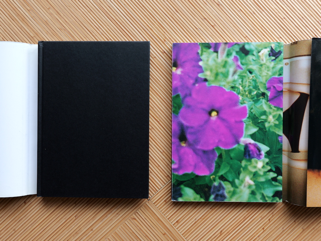
…a simple, black cloth-bound cover.
…シンプルな真っ黒の布カバーが現れます。
I have to admit this seems a little odd given the subject matter and photographer. Compared to the energy of Girls Blue, the German-made book is downright conservative. The Stidel book is crisply cool, sure- but much of the freshness and youthful spontaneity of Girls Blue is muted. Is this simply the evolution of an artist? (I think so.) Is its use of this traditional binding- along with its more refined presentation/selection of photographs- to “elevate” (recalibrate) Hiromix’s work into a European Art Photography setting? Is a black-cloth, hardcover book more “serious” in terms of status? Was Girls Blue too “cheap” or seemingly immature for an international audience- or non-Japanese booksellers- at the time? (I say “at the time” because if current used prices are any indication, this book is now taken quite seriously by collectors)
I have hunches but no real answers to these questions. I can say though that both photobooks are excellent, and their different approaches to design enriches a reader’s experience with her work.
『girls blue』のエネルギーとくらべると、このドイツ製の写真集はやや保守的に感じられます。Steidl社の写真集は確かにキリッとクールな印象ですが、HIROMIXさんのフレッシュさや若さが溢れるのびのびとした雰囲気の多くは抑えられているように感じます。伝統的ともいえる装丁は、より洗練された表現と写真のセレクションとともに、ヨーロッパのアートシーンに向けたものなのでしょうか。『girls blue』の作りは当時の日本以外の読者や書店にとって、安っぽく、あるいは未熟に見えたのでしょうか(あえて「当時」と書いたのは、現在の中古価格が示すとおり、今ではコレクターにとっても価値が上がっているからです)。
これらの疑問に対する答えは、今のところ見つかっていません。しかし、どちらの写真集も素晴らしいものであり、デザインに対するアプローチの違いによって、読者の作品体験がより豊かなものになることは確かです。
This had me wondering if hidden cover images are a Japanese thing. I started investigating my shelves. Of the western-designed photobooks (with dust jackets) that I own, I couldn’t find a single one that was hiding a picture.
表紙カバーの下に隠されているおまけ写真は、日本独特のデザインなのかどうか確認するため、今一度自分の本棚を調べてみました。私が持っているカバー付きの海外写真集のうち、写真が隠されているものはひとつも見つけることができませんでした。
- 11. Tod Parageorge トッド・パパジョージ
- Passing Through Eden: Photographs of Central Park, (Steidl, 2007)
- 12. Garry Winogrand ゲイリー・ウィノグランド
- Figments from the Real World, (MoMA, 1990)
- 13. Joel Meyerowitz ジョエル・マイヤーウィッツ
- Wild Flowers (New York Graphic Society, 1983)
- 14. Helmut Newton ヘルムート・ニュートン
- Us and Them, (Scalo Verlag Ac, 1991)
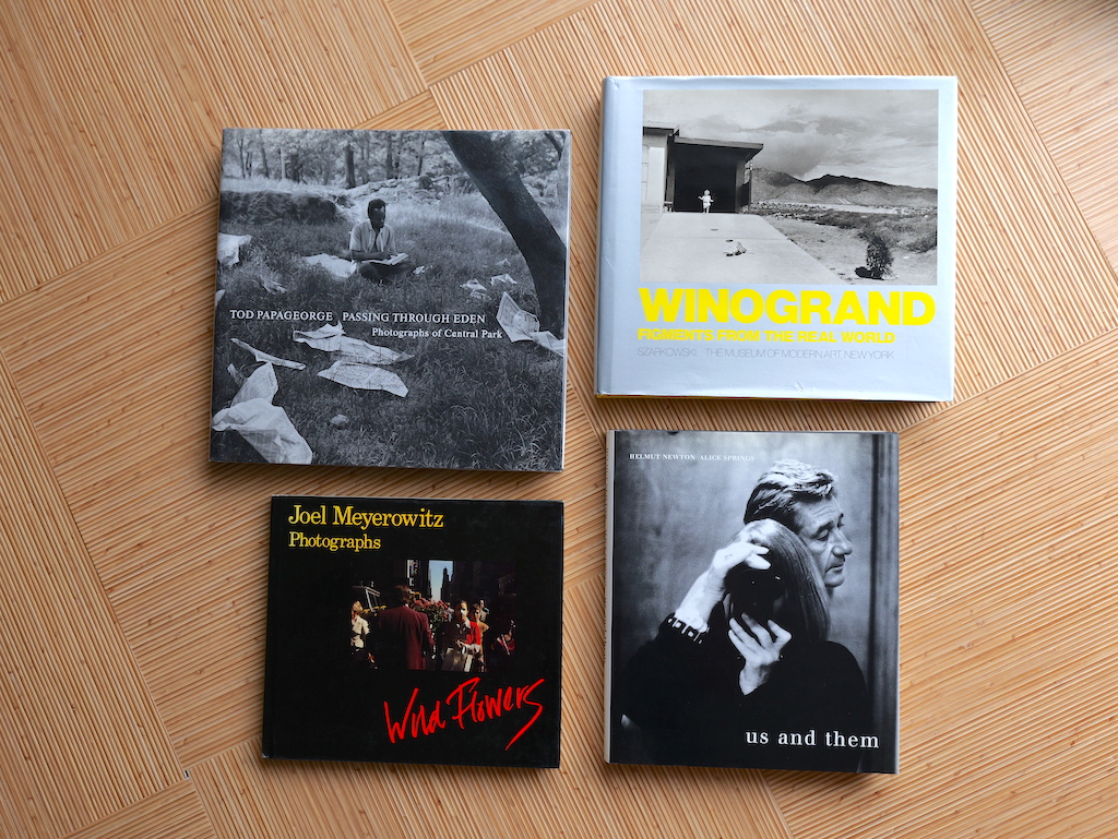
Checking under the dust jackets of these four classic books….
この名作の四冊のブックカバーをめくると…
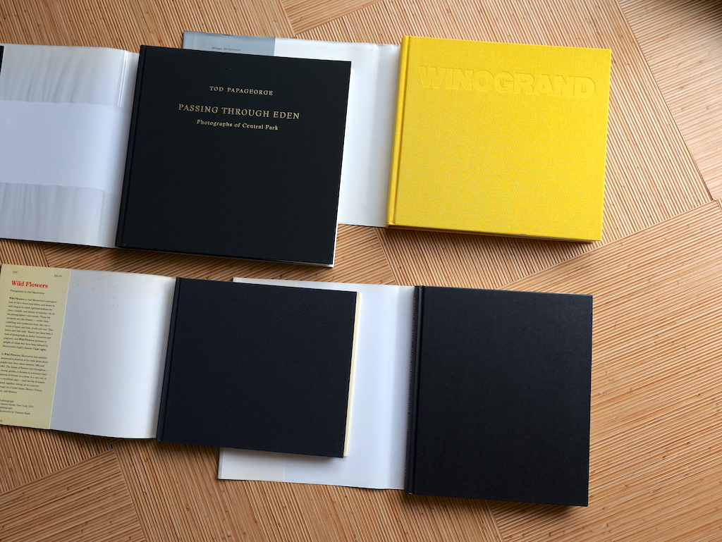
… simply revealed traditional, cloth-bound books.
...従来の布張り装丁です。
Papageorge’s stands out a bit because of its gold-leafed embossing. And while Winogrand’s MOMA book is bright yellow, the Meyerowitz & Newton books are both flat, black cloth rectangles. The same goes for my copies of Robert Frank’s The Americans (Stidel, 2008) and Friedlander’s Self Portrait (MOMA, 2005 edition).
Why is this?
左上にあるトッド・パパジョージの本は、金箔のエンボス加工が施されているため、少し目立ちますね。 右上のゲイリー・ウィノグランドの本は鮮やかな黄色ですが、ジョエル・マイヤーウィッツ(左下)とヘルメット・ニュートン(右下)の本はどちらも平らな真っ黒い布の長方形です。ロバート・フランクの『The Americans』(Stidel、2008年)とリー・フリードランダーの『Self Portrait』(MoMA、2005年版)も同様です。これはなぜなのでしょう?
I’m no expert in the history or technical details of book binding, but cloth covers are certainly practical. I can’t imagine that book binders are a very adventurous sort- and I assume that long-established ones have production setups that are not easily adjusted beyond cover dimensions and color choices.
私は製本の歴史や技術的な詳細についての専門家ではありませんが、布張の表紙は確かに実用的だと感じます。製本業者というのはなんとなくあまり冒険をしないものだと思うし、老舗の製本業者であれば、表紙の寸法や色の選択以上に、簡単には調整できないような生産体制をとっているのかもしれません。
And yet, I can’t help but feel that there is a cultural element at work, too.
How much of this issue of “hidden” pictures is the difference between a Western importance on practicality and reason (why hide a photograph?) and a Japanese perchance for enjoying a slight “trick”? There’s something slightly subversive in rewarding a curious reader with extra pictures.
それにしても、文化的な要素が働いているような気がしてならないのです。
実用性や理性を重視する西洋人と、ちょっとしたトリックを楽しむ日本人の違いなのでしょうか。好奇心旺盛な読者に対して、余分な写真というご褒美を与えることは、ちょっとした破壊的な何かがある気がします。
Of course, I need to clarify that not every Japanese photobook (on my shelves at least) hides photographs like in the examples above. Peeking under other dust jackets often simply reveals the title and some graphic design flair.
Still, this sort of interaction that Japanese books (photos and otherwise) encourage is part of the fun.
もちろん、すべての日本の写真集が上の例のように「隠し写真」があるわけではありません。タイトルのみが印刷されているものも多いです。それでも、日本の写真集が促すこのような相互作用は、楽しみの一部です。
So, if you’ve got any Japanese photobooks on your shelf, go take a peek under the covers...
さあ、あなたの本棚に眠っている写真集のカバーの下を覗いてみてください。これは一つの写真集楽しみ方です。


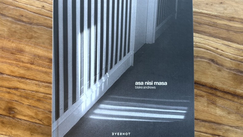
〉46 Blake Andrews ブレイク・アンドリュー『Asa Nisi Masa』
2026/01/18
〉45 My Favorite Photobooks 2025
2025/12/21
〉44 Masakazu Murakami "Dream Within a Dream" 村上仁一『夢の又夢』
2025/12/13
〉43 Jiro Kochi / 高地二郎『GINZA: Through the eye of a Salaryman 1950-1990』
2025/10/19
〉42 Shigeru Yamazaki 山崎茂『Afternoon 1974–1977』
2025/08/10
〉41 Nobuyoshi Araki "Living Cats in Tokyo" 荒木経惟『東京猫町』
2025/06/07
2025/04/21
〉ヨッヘン・ライス / Jochen Raiß "Frauen auf Bäumen (Women in Trees)"
2025/03/04
〉38 Meisa Fujisirho / 藤代冥砂『90 Nights』
2025/01/24
〉37 My Favorite Photobooks 2024
2024/12/08
〉36 Keizo Kitajima "NEW YORK" [New Edition] 北島敬三『NEW YORK』[新版]
2024/11/08
〉35 Haruto Hoshi "SHINJUKU 1999-2008" 星 玄人『新宿 1999-2008』
2024/11/02
〉34 Photobook Looking: Under the Covers 写真集の"裏"の見方:カバーを外してみよう
2024/08/30
〉33 Shigeichi Nagano "Tokyo1950s" 長野重一『東京1950年代』
2024/08/16
〉32 Joel Meyerowitz / ジョエル・マイヤーウィッツ『GLIMPSE』
2024/08/02
〉31 The sudden appearance of the Ushiku Daibutsu 『牛久大仏忽然の貌|世界一の阿弥陀像完成までの1765日を記録』
2024/06/07
〉30 Akira Takano "Tokyo Now and Then: Views of the city from a fixed point" 鷹野 晃『定点写真で見る 東京今昔』
2024/05/10
〉29 Mitsugu Ohnishi 大西みつぐ『TOKYO EAST WAVES』
2024/04/05
2024/03/01
〉27 Ishikawa Naoki "Hair" 石川直樹『髪』
2024/01/12
〉[SPECIAL]John Sypal Favorite Photobooks 2023
2023/12/15
〉26 Motohiko Hasui 蓮井元彦『VIATOR / SWELL』
2023/12/01
〉25 Shigeru Yamazaki 山崎 茂『Weekend』
2023/11/03
〉24 Tsubasa Kawaguchi "Breathless" 川口翼 『心臓』
2023/10/06
〉23 Yoshihiko Ueda "Always Dream" 上田義彦『いつでも夢を』
2023/09/08
〉22 Kazuo Kitai "Journey into German Expressionism" 北井一夫『ドイツ表現派紀行』
2023/08/04
〉21Issei Suda "Minyou Sanga" 須田一政『民謡山河』
2023/06/30
〉20 Yusuke Yamatani "ONSEN Ⅰ" 山谷佑介『ONSEN I』
2023/06/02
〉19 Wan Chaofan "Yes, The River Knows" 宛 超凡『河はすべて知っている——荒川』
2023/05/05
〉18 Shuhei Motoyama "NIPPON 2010-2020" 本山周平『日本・NIPPON 2010-2020』
2023/04/07
〉17 Yasuko Noguchi "In Search of Sakura" 野口靖子『桜狩り In Search of Sakura』
2023/03/10
〉16 Sha Shin Magazine vol.3 "Spell" 雑誌『写真』第3号「スペル」
2023/02/10
〉15 Two Lives Two Zines: Cats, Love, & Sneakers 2つの人生、2つのZine「愛、猫、スニーカー」
2023/01/15
〉14 Rika Noguchi "My Father’s Album" 野口里佳『父のアルバム』
2022/12/09
〉13 Shigeru Yamazaki "The Station 1974-77" 山崎茂『The Station 1974-77』
2022/11/11
〉12 Three Miniature photobooks 豆本写真集3選
2022/10/14
〉11 Isamu Morisawa “Karuizawa Days” 森澤 勇『軽井沢時代 1947-1960』
2022/09/09
〉10 Léo Berne "Je t'aime - Je t'aime" レオ・ベルン『Je t'aime - Je t'aime』
2022/08/12
〉9 Shinya Arimoto "Tokyo Strut" 有元伸也『Tokyo Strut』
2022/07/15
2022/06/18
〉7 Kazunori Kouno "ETERNAL RHYTHM" 河野和典『永遠のリズム』
2022/05/20
〉6 Yusuke Yamatani "Rama Lama Ding Dong" 山谷佑介『RAMA LAMA DING DONG』
2022/04/22
〉5 Naoki Ishikawa"Okunoto Peninsula" 石川直樹『奥能登半島』
2022/03/25
〉4 Koji Onaka "memories of younger days in Shinjuku" 尾仲浩二『あの頃、新宿で』
2022/02/25
〉3 Motohiko Hasui “for tomorrow” 蓮井元彦『for tomorrow』
2022/01/28
〉2 Keizo Motoda"Good Morning from Nagisa-Bridge" 元田敬三『渚橋からグッドモーニング』
2021/12/24
〉Kazuo Kitai “COLOR Somehow Familiar Places” 北井一夫『カラー いつか見た風景』
2021/11/26


PCT Membersは、Photo & Culture, Tokyoのウェブ会員制度です。
ご登録いただくと、最新の記事更新情報・ニュースをメールマガジンでお届け、また会員限定の読者プレゼントなども実施します。
今後はさらにサービスの拡充をはかり、より魅力的でお得な内容をご提供していく予定です。
 「Photo & Culture, Tokyo」最新の更新情報や、ニュースなどをお届けメールマガジンのお届け
 書籍、写真グッズなど会員限定の読者プレゼントを実施会員限定プレゼント


 46 Blake Andrews ブレイク・アンドリュー『Asa Nisi Masa』
 45 My Favorite Photobooks 2025
 44 Masakazu Murakami "Dream Within a Dream" 村上仁一『夢の又夢』