ONLINE SHOP


Last month I wrote a bit about the process that leading up to the publication of my book, Tokyo Silver Paradise. (You can read it here https://photoandculture-tokyo.com/contents.php?i=1395 )
That entry ended with the prints for it scanned but with the deadline for the title and statement approaching. Like I said, taking the photos is the easy part. Titling something, for me anyway, is tricky. The best titles appear naturally a series coalesces.
My very first show, back in 2003 at the University of Nebraska was of two dozen photos taken during my year abroad in Japan. With apologies to Robert Frank, I cheekily named it “Nihonjin” (“The Japanese”).
My debut show in Japan was, conversely, with photographs taken in Nebraska. I couldn’t think of a better title than the motto that appears on large welcome signs at the state border: “Nebraska, the Good Life”. Sounds good to me. Inspiration (or good a good) is out there.
My 2007 show at Konica Minolta Plaza I titled “The Difference Between” since it was photography made as I was settling into Japan and exploring differences- certainly those between myself and Japan, and those between reality and photography.
In 2008 I did a show of pictures that I took of other foreigners I passed on Tokyo’s streets: “Gaijin Like Me”, with its dual readings, worked wonderfully. My second show at Totem Pole Photo Gallery in 2010 was titled “An Endless Attraction”. I found this title by simply asking myself what photography is on a personal level. That was my first of many Totem Pole shows- and, not wanting to have to make any more titles after that, for the rest I settled on Zuisha- (随写) a word I kind of invented that is a photo-themed reference to the Japanese free-flowing essay structure called “Zuihitsu”. (“Follow the brush”- but here I replaced brush with “photo”.)
The pictures in Tokyo Silver Paradise were taken from my Zuisha series- just about all in the book appeared in my exhibitions- but with its new edit, I didn’t want to give it the same name. I don’t know how many books I’ll ever produce but it seemed a waste to have two with the same name.
I had but a few rules for a title- things to help coax my hunches along.
First, it had to start with Tokyo. Zen Foto’s series, of which it was to be a part, already had several books beginning with the city’s name. But this was precisely why I felt mine needed to incorporate it, too. I already feel a connection to the photographic legacy (conversation?) of Tokyo through my mentor Mitsugu Ohnishi and his mentor, Issei Suda. With both men having Tokyo-titled books in this Zen Foto series, it seemed natural.
My second rule was for the title to reflect my love of film photography. Silver halides- silver grains, silver prints- maybe something with “silver” in it?
The deadline approached- and since passively waiting for a moment of inspiration to strike wasn’t working, the night before the deadline was due I went to my bookshelf and reached for one of Nobuyoshi Araki’s books of books by Nobuyoshi Araki (Arachy Photobook Mania, Izu Photo Museum 2012).
If anyone knows how to title a set of pictures- particularly with Tokyo in the title, it’s him.
So, through the pages and down the book-lists I went. I wasn’t looking for a full title to appropriate of course. I was only after a spark of some sort. And there, at entry #91 was Momo no Sono: “The Peach Orchard” (Ota Shuppan, 1991). Since it’s an Araki book, I’ll let you imagine what the Peaches might be- but the kanji for Orchard, 園 ,was the spark I was searching for. Alone, this character can be read as “sono” (Orchard) but it also means park, or even paradise. What’s more, when combined with other kanji it can be read as “en”.
Now, in Japanese, a silver gelatin print is called a gin’en銀塩 print- (literally “silver” & “salt”).
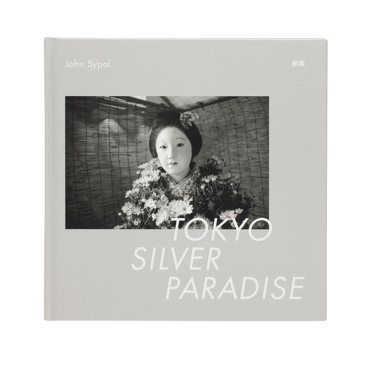
“Gin’en”. 「銀園」A title that reflects my view of the city as a grand, photographic paradise and is a slight pun at the same time?
That was it. Done.
Adding “Tokyo” for the English title, I was set. Tokyo Silver Paradise.
The afterward, after some wrong-way starts, eventually ended up writing itself in a burst of clarity.
Ok. The photos, now data, are with the publisher. The titles and text are done- time to see some sample pages. Time to go to press.
Now, I will be the first to admit that I don’t know much of the technical side of photography. I know just enough on the photo-taking, film-developing, picture-printing side to consistently make images that both interest me visually and satisfy my standards for physical prints. This however is volumes more than I understand about photographic reproductions and offset printing. Thankfully the book’s designer, Kakinuma-san, so well versed the details of this craft, was, with great patience, able to explain the nuts and bolts of the project every step of the way. Often this was in the form of choices- paper stock, printing tones, and cover colors.
With “Silver” in the title, we decided to do a silver stock. But more on that later. (The less said about my original desire for fuchsia, the better.)
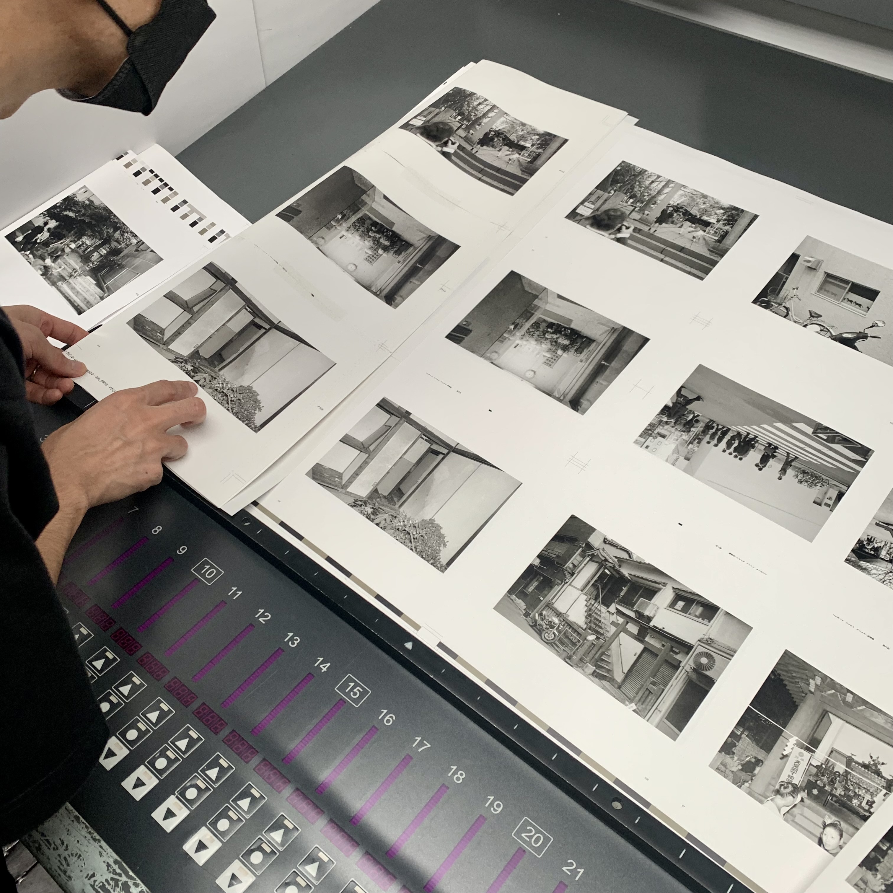
I’m going to skip ahead to the actual printing day- in between were a few sample print/tone checks- but the Big Day was quite interesting.
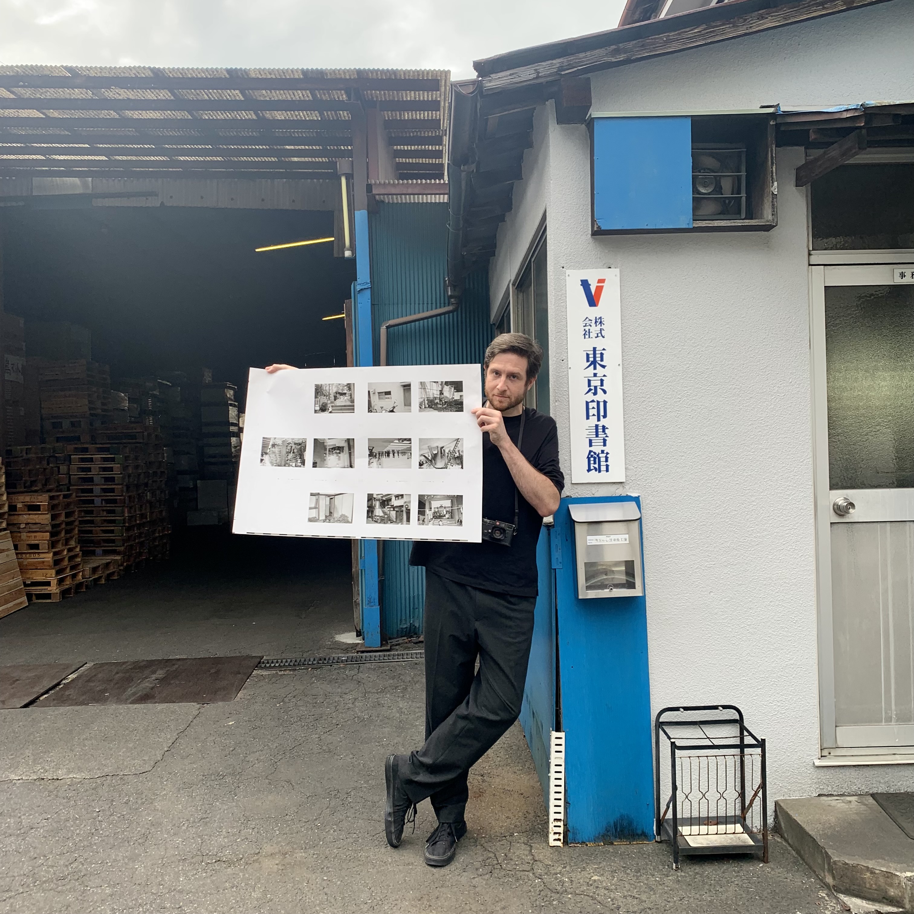
On a warm early afternoon in late September I arrived at one of those midway suburban/rural/bedroom town stations in Saitama, just north of Tokyo. A representative from Tokyo Inshokan Printing Co. Ltd met me in a silver four-door sedan. Sitting in the back seat, we drove away from the station- the tall condos soon ended where the standard urban Japanese highway commercial sprawl began. After a few minutes of that, we turned off into a subdivision of newish, plasticky Western-looking two-story houses a meter apart. As we wound through, the houses gave way to more high-walled industrial sites and sagging, concrete company dorms. The driver pulled into an entryway. Before us was a large hall of a building – a barn?- its tall doors were open on both sides. Along its dark walls were stacks of unopened reams and rolls of paper. Out the other side I could see a forklift in the sunlight.
Bonnie and Kakinuma carefully came down a Showa-steep staircase and got in the car. They had been there since morning, checking on the printing. I’d get to see the presses- but first, lunch. (A local seafood shop- I got the fried chicken set.)
Full, we returned to the printing complex. It looked like it had been there since the 60’s, at least. “Want to see the presses?”
Of course.
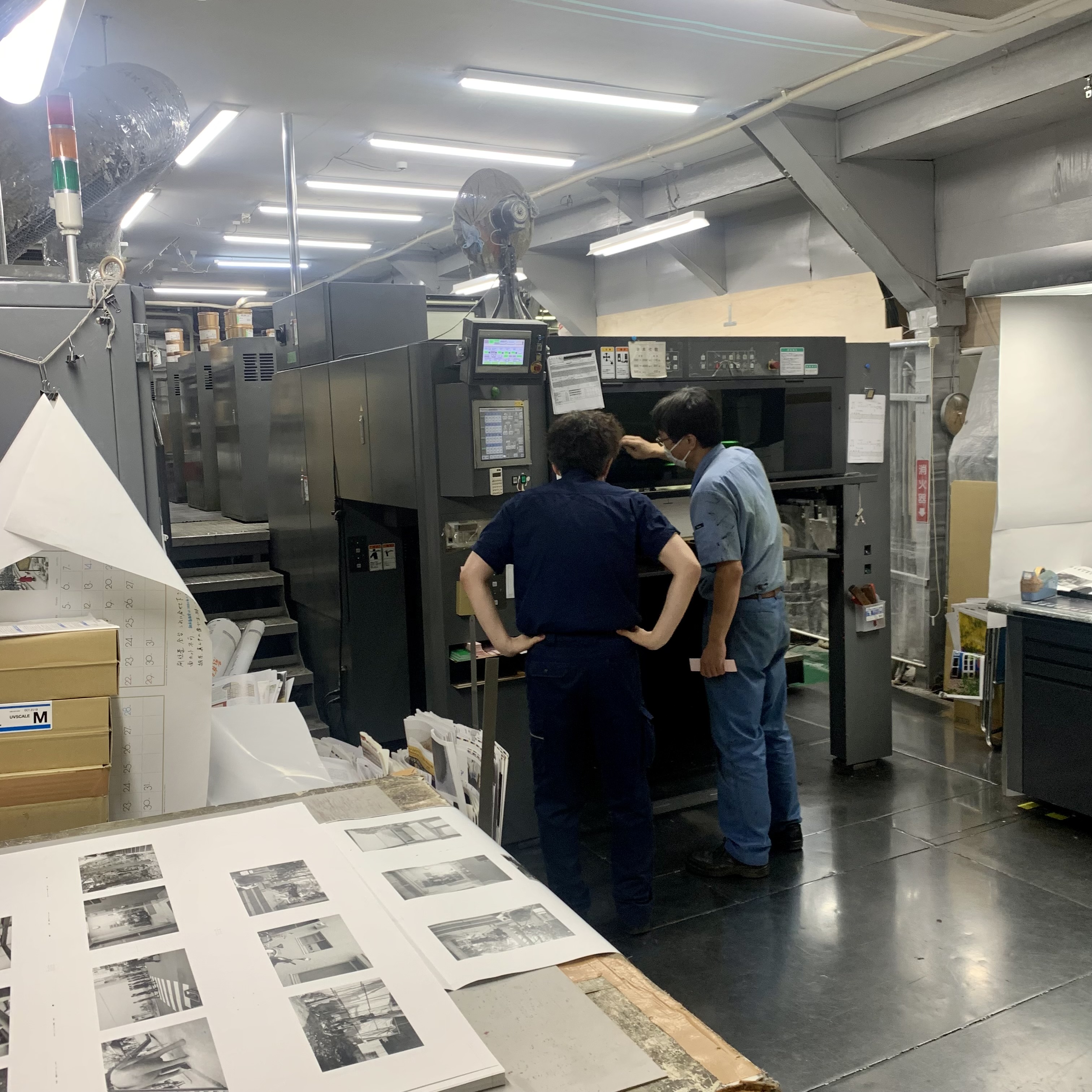
We entered- Several large printing presses were chugging along at their own paces. The rhythm of these presses, with the smell of paper and ink and knowledge that a book was being born- it was intoxicating.
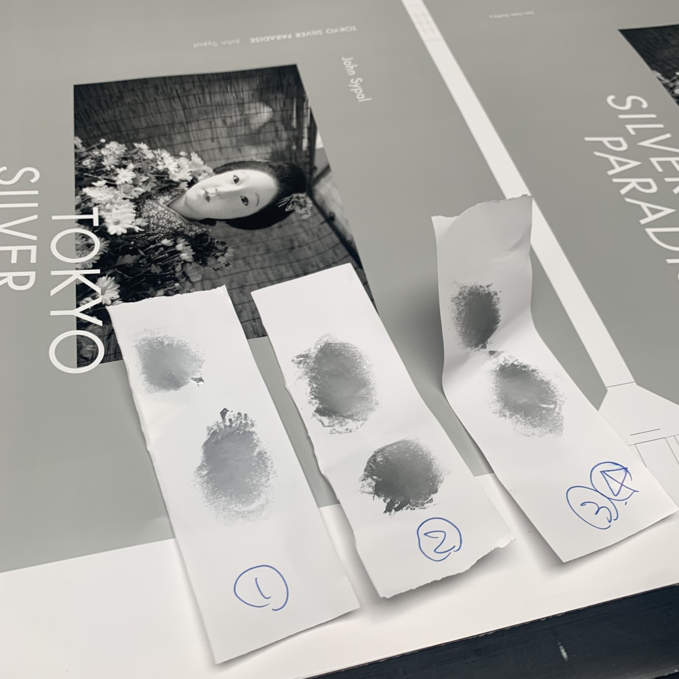
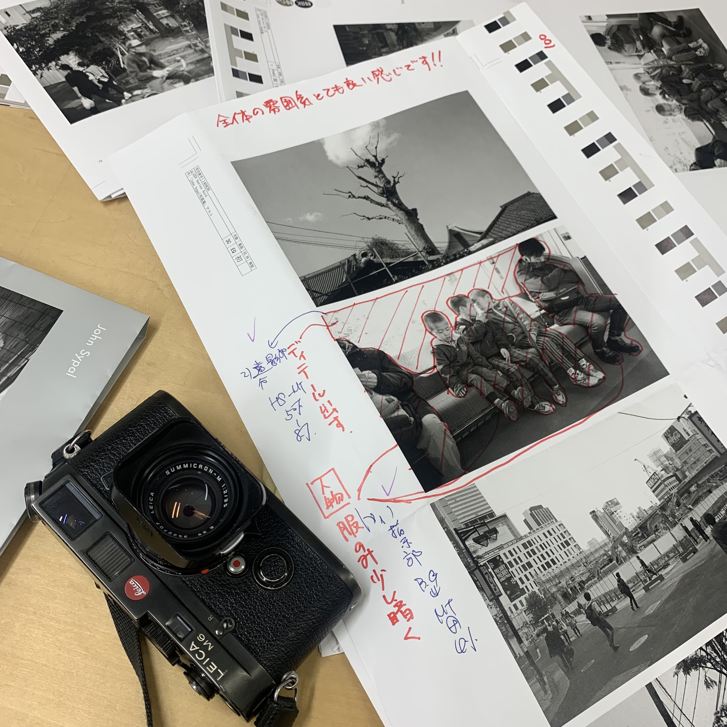
At well-lit proofing table I was handed a fat black permanent marker. The printing director, in his blue overalls and wily hair, laid down a paper of full, uncut pages. Asked to sign it, I hesitated- fan service?
Nope- my mistake- the artist is supposed to confirm that the print quality is acceptable. That it was. Someone clapped- someone else took a video, and then Bonnie, Kakinuma-san, and I stepped outside. Printing a book isn’t non-stop printing- presses need to get cleaned and set up- and while the staff did that the three of us waited in a small room above the main press floor. In it was a table with some sembei crackers and chocolates. I had a coke. On a shelf was a selection of books that Tokyo Inshokan had printed- they’re particularly known for the quality of their art and photobooks. There’s not much to say after that- we were called down to the presses each time a new plate was tested. (Since the second floor was socks-only, I regretted not wearing slip-on shoes that day- tying your shoes in a small genkan at the top of a steep steel staircase ten times over an afternoon is not as fun as it sounds.)
On one of the later press-floor visits I was greeted by Noboru Takayanagi- the charismatic, award-winning printing director of Tokyo Inshokan. Looking like he had stepped out of a Wes Anderson film in his impeccable suit and wingtip shoes, I remembered that I had seen him before. It was at the Daido Moriyama opening in Harajuku that spring. In fact, many of Moriyama’s books were done under his direction at Tokyo Inshokan.
Back to the printing- I signed proof sheet after proof sheet- and then, we were done.
Almost.
The cover still needed to be printed.
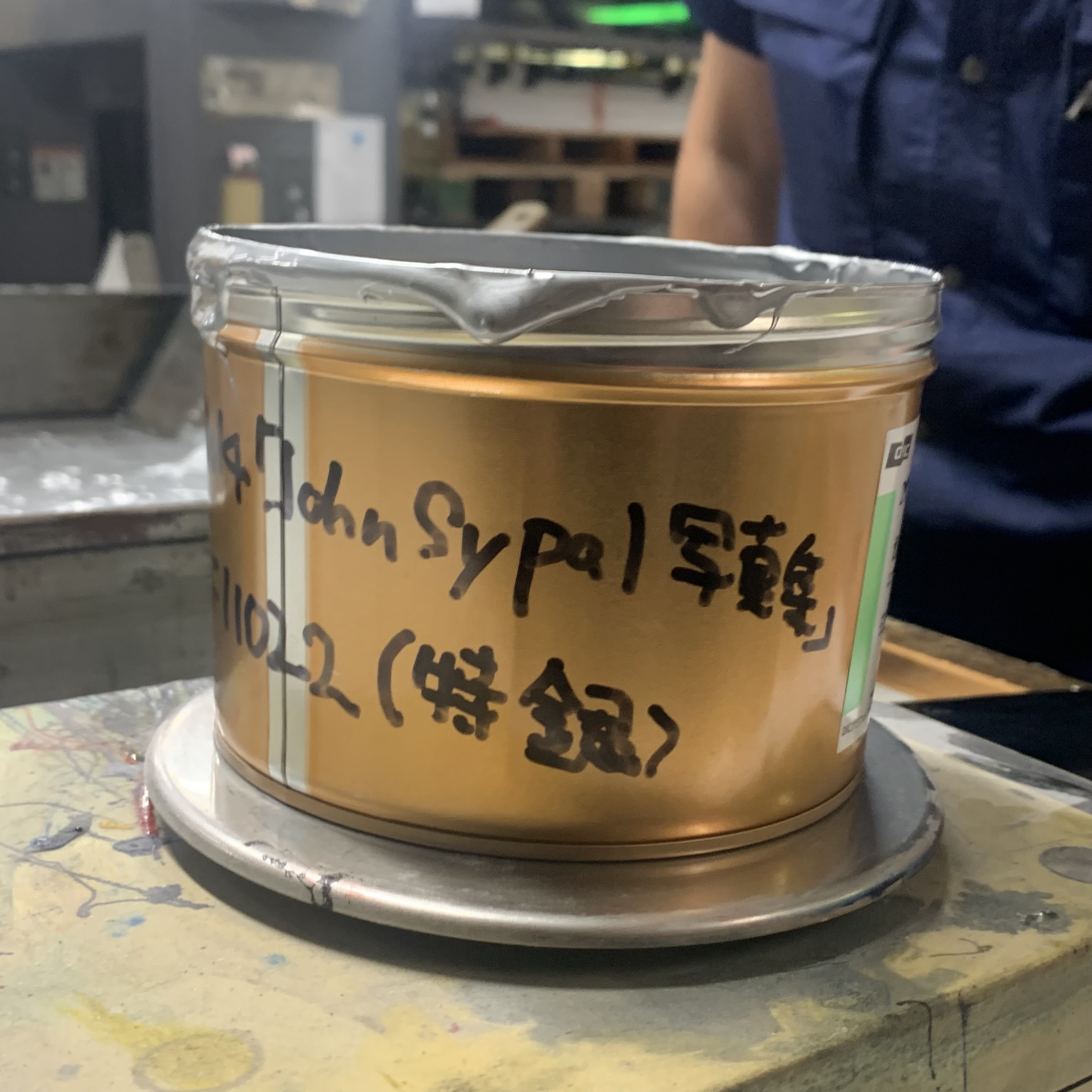
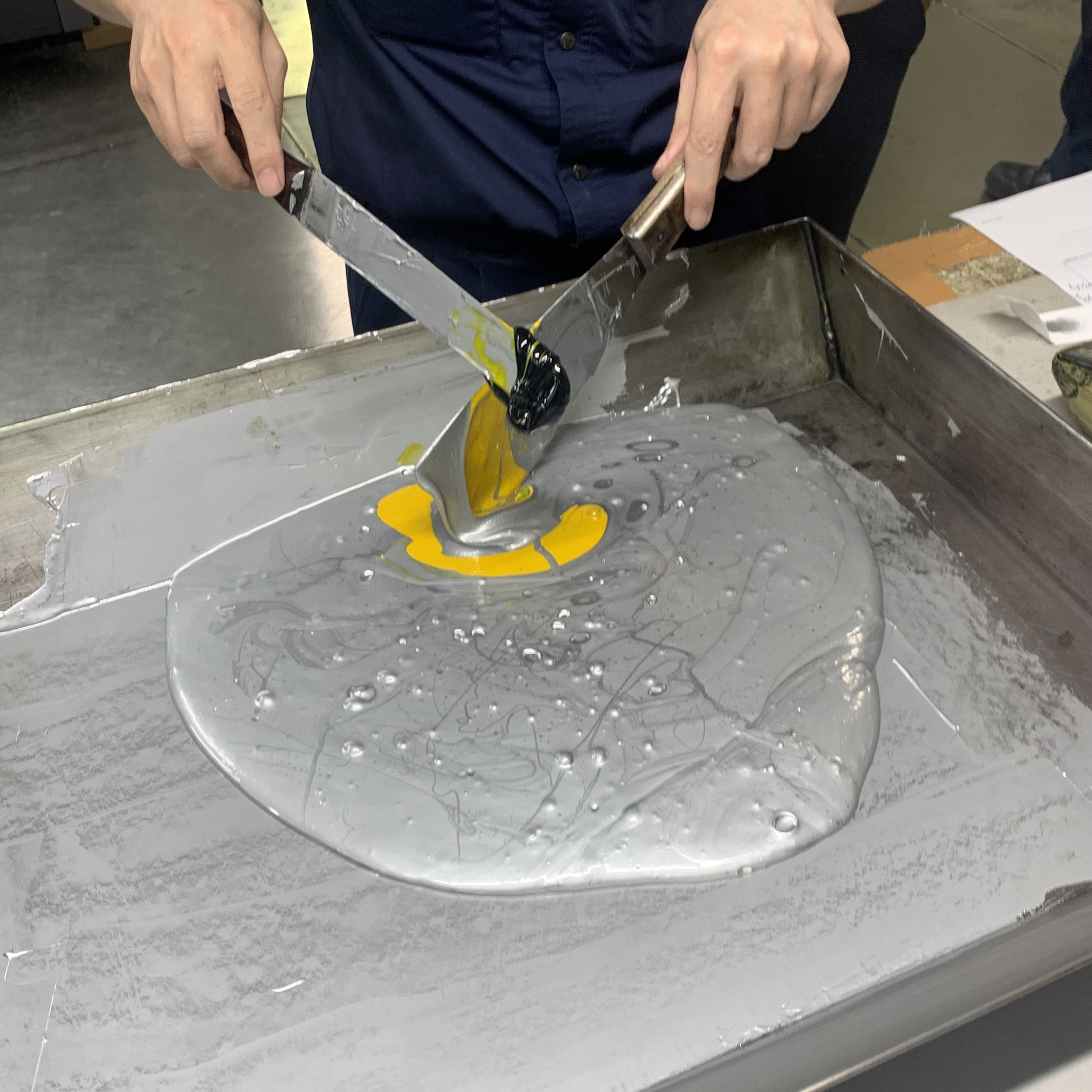
As I said before, Tokyo Silver Paradise is part of a series- and one its unifying design elements is that each entry’s cover is done in a different solid color of ink. For my book, silver was the obvious choice. Called back down to the press floor, the director brought out a tray and a gold, small paint bucket. My name was scrawled on its side-- this, I was told, is silver ink that had been specially mixed in Osaka. Takayanagi-san asked what tone I’d like the silver cover to be. One of the staff brought out a container of yellow ink, and one of black. To a few small blobs of silver on slips of cover-paper stock, Takayanagi-san expertly added a either a dab of yellow or black to each- these he quickly mixed with a toothpick. Suddenly I was presented with a few tones of silver to choose from. A slightly warm one fit best. He and the printing director went to work, spreading the Osaka Silver ink into the tray. With a paint scraper, a bit of black and yellow was mixed in. (More iphone videos were shot)
This new ink was put into the press and a test print was made.
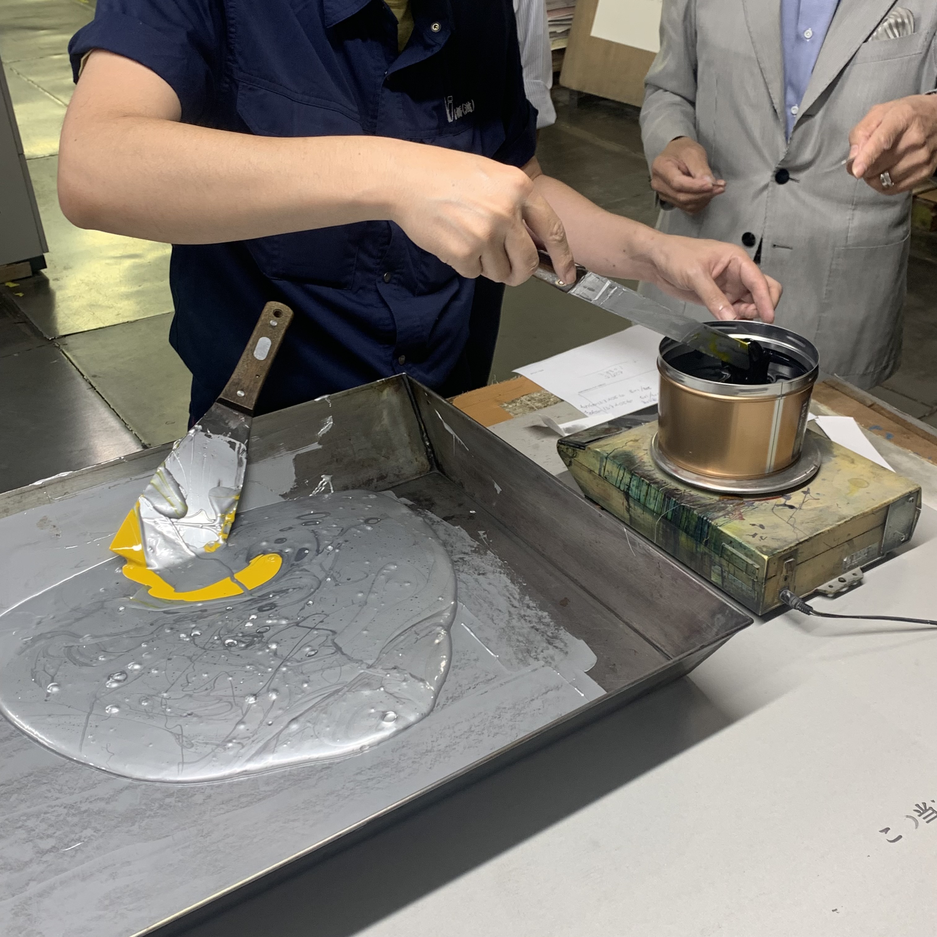
Round one: A tad too blueish.
Round two: Adding little more yellow helped but now it had a greenish hue.
Round three: Just right.
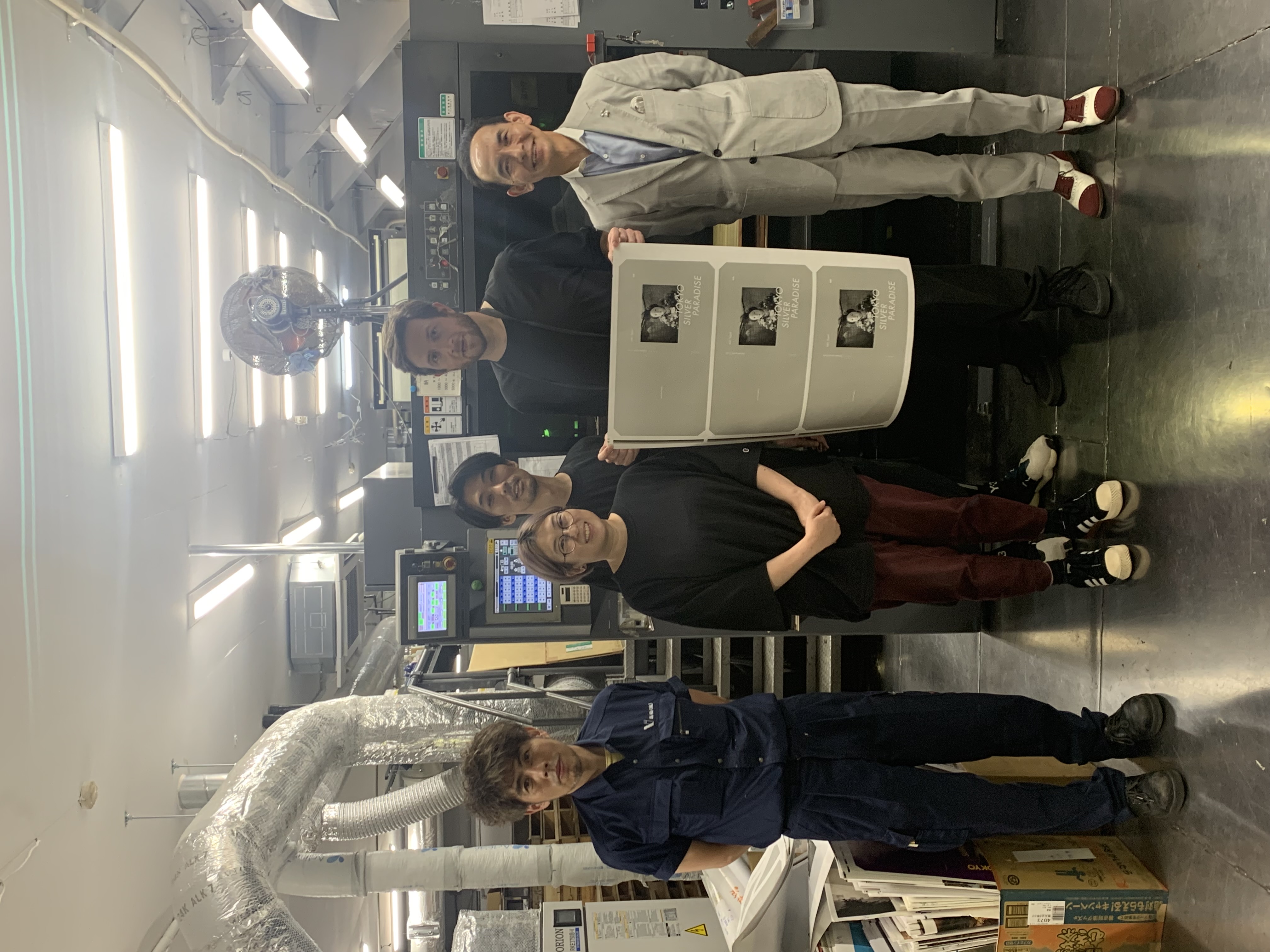
Another test- another signature- another visit upstairs to the waiting room. It was after dusk by now. I had already looked through all the books and ate too many sembei- then, the three of us well into individual smartphone scrolling sessions, a knock at the door. We were done! Back on the press floor we posed for some pictures- some of the printing tech guys looked exhausted- I thanked them and everyone involved. Someone handed me a wrapped roll of test prints- I got back into the sedan for the ride to the station and took the train home.
A few weeks later, on an evening in mid-October, I went down to Zen Foto to see the completed, bound book.
Opening your photobook for the first time is an experience. Obviously, it’s exciting. It’s a moment of pride and awe. It’s also a little odd. I couldn’t “see” the pictures clearly. My eyes were fine- it was my mind. Each image leapt from the page in blurred sensation of memories. Actual moments overlapped with the images appearing in the developer under the safelight- and as prints on the wall of Totem Pole Photo gallery, and as the digital files that I spent hours and hours with moving around on my computer screen. This sensation soon subsided- but it stuck home how photographs exist on a continuum of time across mediums.
At Zen Foto I sat down before a ziggurat of fresh copies to sign. One by one I opened each cover, and on the fuchsia end paper, signed my name. This too, felt a little odd. I didn’t actually “make” the book. While their names were in the credits in the back, it was the result of cooperation and finances and expertise of generous, dedicated, and talented people. Considering this, the book didn’t feel “mine” in the way that I might have thought one would a few years earlier.
But this is a good thing. Tokyo Silver Paradise is “mine”- but it’s also yours.
Photography, I’ve learned, isn’t about one Great Image or a masterpiece of a book- it’s, while maybe not financially, a way of living- a source for new encounters and experiences.
I hope that your experiences with this book provide both visual satisfaction and motivation for your own approach to photography.
先月は私の写真集『銀園 Tokyo Silver Paradise』の出版に至る経験についてレポートの前半、プリントをスキャンしたところまででした。
(https://photoandculture-tokyo.com/contents.php?i=1395)
当時タイトルとステートメントの締め切りが迫っていました。私にとって写真を撮るのは簡単なことですが、 タイトルをつけるのは難しいことです。最高のタイトルは、シリーズがまとまったときに自然に現れるはずなのですが、今回はしばらく思いつきませんでした。
タイトルについてですが、私が初めて開催した写真展は2003年、ネブラスカ大学でした。内容は日本への留学中に撮影した写真で構成しました。ロバート・フランクには申し訳ないですが、Americanの私は「Nihonjin」というちょっと生意気なタイトルをつけてしまいました。
日本でのデビュー展は、逆にネブラスカで撮った写真を発表しました。実家のあるネブラスカ州の州境に大きな「ネブラスカへようこそ」という歓迎看板があります。その看板に書かれている標語は「ネブラスカ、ザ・グッドライフ(Nebraska, the Good Life)」で、展示のタイトルはこれしかないと感じました。
2007年のコニカミノルタプラザでの個展は、「The Difference Between」というタイトルにしました。この写真は来日してから撮ったものです。日本に慣れ、自分と日本との違い(Difference)、現実と写真との違いについて模索している写真でした。
2008年にはニコンサロンで、東京の街ですれ違った外国人を撮影した写真展を開催しました。タイトルは「Gaijin Like Me 」。二重の読み方で、とても効果的だった気がします。
2010年からTotem Pole Photo Galleryにて写真展「随写」シリーズを始めました。シリーズなら、毎回新しいタイトルを考えなくていいという思いから「随写」という言葉を作りました。
Tokyo Silver Paradiseの写真は「随写」シリーズから新たに編集したものです。同じ名前の本が2冊あるのはもったいないと思ったんです。
タイトルは、自分の勘を働かせるために、2つの決まりがありました。まず「東京」から始まること。このZEN FOTOのシリーズにはすでに東京という名前がついた本が何冊かあるので、だからこそ私の写真集にも東京を取り入れるべきだと思ったのです。私は写真家の大西みつぐさんや須田一政さんを通じて、東京の写真遺産とのつながりを感じています。このZEN FOTOシリーズで、二人が東京をタイトルにした本を出しているのは、自然なことだと思っています。
2つ目のルールは、私のフィルム写真への愛情を反映したタイトルにすることでした。銀塩…銀の粒…銀のプリント…何か "銀 "が入っているもの…。
タイトルの締め切りが近づき、受動的にインスピレーションの瞬間を待っていてもうまくいかないので、締め切り前夜、本棚に向かい、荒木経惟さんの写真集をまとめた写真集(『写真集狂アラーキー』・伊豆フォトミュージアム、2012年)を手に取りました。天才アラーキーは写真集タイトルの天才でもあります。
本のページをめくり、本のリストを見ました。何かのきっかけが欲しかったのです。
写真集91作目は『桃の園』(太田出版、1991年)です。荒木氏の作品なので「桃」は想像にお任せしますが、「園」という漢字が、私の探していた火種でした。
この漢字は単独では「ソノ」と読めるのですが、「公園」「楽園」など「エン」とも読めるのです。
私が見ている東京は写真楽園です。日本語では、シルバーゼラチンプリントを「銀塩プリント」と呼ぶので、「銀」と「園」をくっつけて、「銀園」と決まりました。そして、英文タイトルに「Tokyo」を加えて、完成です。Tokyo Silver Paradise。
写真もデータで出版社に渡しました。タイトルとテキストも完成し、あとはサンプルページを見るだけ、いよいよ印刷です。
正直、私は本を作ることについてあまり詳しくありません。写真を撮ること、フィルムを現像すること、写真をプリントすることについては、私が視覚的に興味を持ち、物理的なプリントの基準を満たすような画像を一貫して作ることができる程度しか知りませんでした。ありがたいことに、この本のデザイナーである柿沼さんは、技術について熟知しており、紙質、印刷の色調、表紙の色など、さまざまな選択肢を提示してくれ、勉強になりました。印刷日までの間にトーンのサンプルチェックが何度かあり、私にとってかなり興味深いものでした。
9月下旬の暖かい昼下がり、私は東京のすぐ北にある埼玉のベッドタウンの駅に到着しました。
「株式会社東京印書館」の担当者が出迎えてくれて車に乗って駅を離れると、高層マンションはすぐに消え、日本の都市部の標準的な高速道路の景色が広がりました。数分後、私たちは、新しくできたかのような西洋風の2階建ての分譲地へ入り、そこを通り抜けるとさらに高い壁で囲まれた工業地帯となりました。目の前に大きなホールがあり、高い扉から見える暗い壁には、未開封の紙束が山積みになっています。反対側には、フォークリフトが陽の光に照らされているのが見えました。
Zen Fotoの担当者ボニーさんとデザイナーの柿沼さんは朝から印刷のチェックをしていました。 印刷所は少なくとも1960年代からある場所のような気がします。
中に入ると、大きな印刷機が何台もそれぞれのペースで動いていました。ガチャンガチャンガチャン。この印刷機のリズムと紙とインクの匂いの悦びに酔いしれました。
裁断されていないテストページの紙を敷き詰めた明るい校正席で、青いオーバーオールを着た印刷部長から、黒くて太い油性マーカーを渡され、紙にサインをお願いされました。
サイン?もしかして、ファンなの?
もちろん冗談です、作者が印刷品質に問題がないことを確認することになっているのです。
そしてボニーさんと柿沼さんと私は、2階にある待合室へ行きました。本を印刷するためには、印刷機の清掃やセッティングが必要で、その間を待ちます。私はコーラを飲みながら棚にあった本をゆっくり眺めていました。
印刷室に呼ばれると、カリスマ・プリンティングディレクターであり、数々の賞を受賞している高柳さんに迎えられました。素敵なスーツにウィングチップの靴を履いた彼に、私は以前会ったことがあることを思い出しました。今年の春、原宿で開かれた森山大道展のときです。実は、森山さんの写真の多くは、東京印書館で高柳さんのディレクションを受けているそうです。
印刷に戻り、私は校正刷りに次々とサインをし、本文の印刷は終了しました。最後は表紙の印刷です。
『Tokyo Silver Paradise』はZen Fotoのシリーズもので、全冊の表紙が違う色のインクで塗られているのが特徴です。 私の本ではシルバーが選ばれました。
ディレクターはトレイと金色の小さな絵の具バケツを持ってきました。これは、大阪で特別に調合された銀色のインクだといいます。 高柳さんが「銀色の表紙は何色にしますか?」と言うと、スタッフが黄色と黒のインクの容器を持ってきて、高柳さんは小さな銀色の塊に、黄色と黒色をそれぞれ一滴ずつ、爪楊枝で手際よく混ぜていきました。
少し暖色系のシルバー。大阪銀のインクをトレイに広げ、ペイントスクレイパーで黒と黄色を少しずつ混ぜ、この新しいインクを印刷機に入れ、試し刷りをしました。
ラウンドワン: 青みが強すぎる。
ラウンドツー:黄色を少し増やしたが、緑がかってしまった。
ファイナルラウンド:ちょうどいい感じ。
そして表紙のテストプリント。 OKとまたマッキーでサイン。表紙の印刷の間、また2階の待合室へ行くともう夕方になっていました。最後に印刷所のフロアで記念写真撮影をしました。
数週間後、10月中旬のある夕方、Zen Foto Galleryへ完成した本を見に行きました。
出来上がった写真集を初めて開くのは面白い経験です。もちろん、わくわくします。誇りと畏敬の念を抱く瞬間です。でも、ちょっと変な感じもします。私はページにあった写真をはっきりと「見る」ことができなかったのです。目は正常なのですが、心がそうさせているのです。ページからは、それぞれのイメージが記憶という名のぼんやりした感覚として飛び出してきます。現像所でセーフライトに照らされ、トーテムポールフォトギャラリーの壁にプリントされ、パソコンの画面上で何時間も一緒に動いたデジタルファイルと、実際の瞬間が重なって見えました。この感覚はすぐに収まりましたが、写真がメディアを越えて時間の連続体の上に存在することを強く印象づけた瞬間でした。
私はサインをするために新しい本の束の前に座り、一枚一枚表紙を開き、濃いピンク色の巻末に自分の名前を書きました。これもまた少し奇妙な感じ。私はこの本を「作った」わけではないのです。巻末のクレジットに名前はあるものの、この本は、寛大で献身的で才能豊かな人々の協力と資金と専門知識の賜物なのです。
そう考えると、この本は、数年前に私が思っていたような「自分のもの」という感覚はありませんでした。
でも、これはいいことです。Tokyo Silver Paradiseは「私のもの」であり、同時に「あなたのもの」でもあるのです。
写真とは、一枚の最高な写真や一冊の名作を作るだけではなく、新しい出会いや経験の源となる生き方であることを、私は学びました。
この写真集が、見てくれる人の視覚的な満足感とそれぞれの自分の写真モチベーションを与えてくれることを願っています。
- ジョン・サイパル John Sypal
- 『銀塩 TOKYO SILVER PARADISE』
- Zen Foto Gallery・2022年
- ¥4,950(税込)
- 200×200 mm、132頁、掲載作品93点、ハードカバー
エディション:700部- https://zen-foto.jp/jp/book/tokyo-silver-paradise-1


〉26 Duets? Duels? Near-overlaps of time and Space across Tokyo. 東京の時間と空間が重なり合う写真集ツアー
2025/04/04
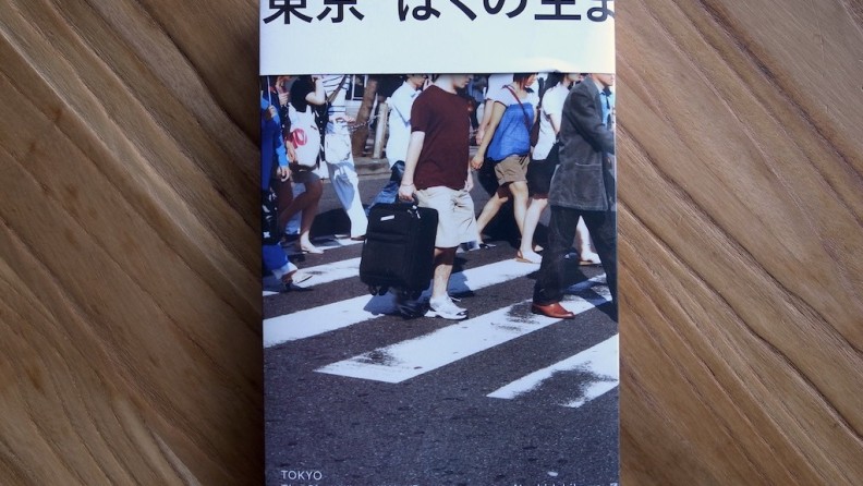
〉25 Naoki Ishikawa "TOKYO The City Where I Was Born" 石川直樹『東京 ぼくの生まれた街』
2024/01/05
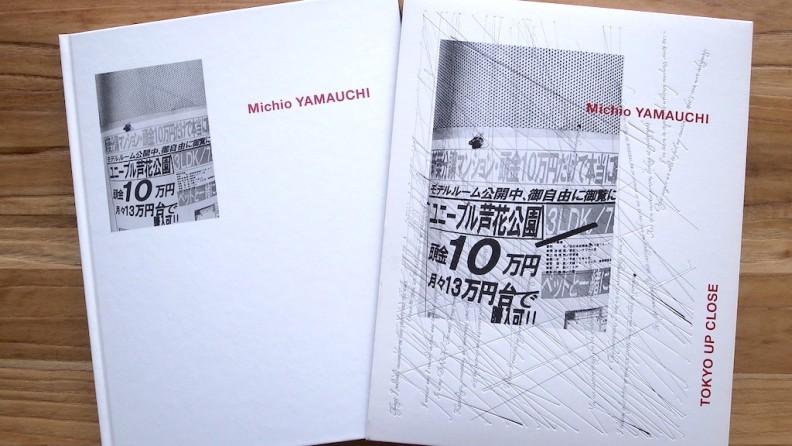
〉24 山内道雄 Michio Yamauchi『TOKYO UP CLOSE』
2023/10/20
〉23 山崎茂 『浅草1974』Shigeru Yamazaki "Asakusa 1974"
2023/09/15
〉22 山崎弘義 Hiroyoshi Yamazaki『CROSSROAD』
2023/08/25
〉21 『東京』名取洋之助 編 "TOKYO" Edited by Yonosuke Natori
2023/07/22
〉20 鈴木 親『新東京』Chikashi Suzuki "SHINTOKYO (NEW TOKYO)"
2023/06/16
〉19 デイブ・ヘンドリー / Dave Hendley『Tokyo Photo Walk』
2023/05/19
〉18 特定の場所から見る東京2:不忍池・弁天島をめぐる写真集
2023/04/21
〉17 特定の場所から見る東京:皇居の東側に架かる「二重橋」をめぐる写真集たち
2023/03/24
2023/02/25
〉15 荒木経惟・飯田鉄・高梨豊『私だけの東京散歩』〈下町・都心篇〉〈山の手・郊外篇〉
2023/01/27
2022/12/23
2022/11/25
2022/10/28
2022/09/23
〉10 岡本正史『Tokyo Summer 2020』&『Everyday Tokyo 2021』
2022/08/26
2022/07/29
2022/07/01
2022/06/03
2022/05/06
2022/04/08
〉4 雑誌『写真』Sha Shin Magazine vol.1
2022/03/11
2022/02/11
2022/01/14
2021/12/10
 26 Duets? Duels? Near-overlaps of time and Space across Tokyo. 東京の時間と空間が重なり合う写真集ツアー
2025/04/04
26 Duets? Duels? Near-overlaps of time and Space across Tokyo. 東京の時間と空間が重なり合う写真集ツアー
2025/04/04
 25 Naoki Ishikawa "TOKYO The City Where I Was Born" 石川直樹『東京 ぼくの生まれた街』
2024/01/05
25 Naoki Ishikawa "TOKYO The City Where I Was Born" 石川直樹『東京 ぼくの生まれた街』
2024/01/05
 24 山内道雄 Michio Yamauchi『TOKYO UP CLOSE』
2023/10/20
24 山内道雄 Michio Yamauchi『TOKYO UP CLOSE』
2023/10/20
PCT Membersは、Photo & Culture, Tokyoのウェブ会員制度です。
ご登録いただくと、最新の記事更新情報・ニュースをメールマガジンでお届け、また会員限定の読者プレゼントなども実施します。
今後はさらにサービスの拡充をはかり、より魅力的でお得な内容をご提供していく予定です。
 「Photo & Culture, Tokyo」最新の更新情報や、ニュースなどをお届けメールマガジンのお届け
 書籍、写真グッズなど会員限定の読者プレゼントを実施会員限定プレゼント