


ONLINE SHOP


This week’s Tokyo Photobook Tour article is a little different than usual.
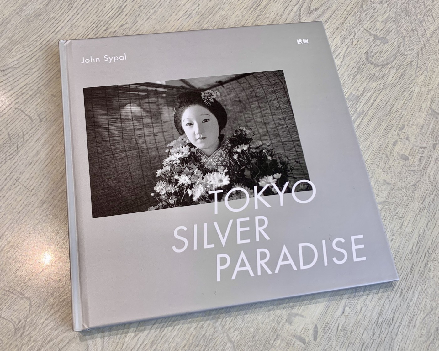
As it almost always does, the featured book has a title that begins with “Tokyo”- but this time the photographer behind it is . . . me.
My newest book, Tokyo Silver Paradise, was published by Zen Foto Gallery in Tokyo in late October 2022. For this column, rather than discuss its photographic content and meaning (I’ll do that later), I’d like to tell a little about my experiences the book’s creation.
Not counting the previously done darkroom work, from conception to picking up the final book in my hands, took about three months or so, with the bulk of the work done in July and August.
But first, let’s go back a bit.
Zen Foto is a gallery that, in addition to its exhibitions, has been publishing a steady stream of unique, beautiful photobooks of Asian photography for over a decade. They’ve produced not only masterpieces by Issei Suda and Seiji Kurata, but also dynamic work by young women such as Tokyo Rumando and Hideka Tonomura. Likewise, Zen’s books range from oversized cloth-covered slip-cased tritone-tomes to experimental, often playful paperbacks of all sizes. In the spring of 2017 I was approached by Zen Foto to publish my debut book, Zuisha. A B5 sized paperback, it is a solid edit of pictures compiled from my ongoing, multi-year series of exhibitions which I show under the same title at Totem Pole Photo Gallery in Shinjuku. Prior to the invitation, Zen Foto’s owner, Mark Pearson would often make time to visit these exhibitions and chat. With his support and encouragement, Zuisha was realized later that year as book which I am proud of- and one I still often look through.
In 2019, Zen Foto initiated a new photobook series to collect work of photographers they had previously collaborated with. With its unified design and cover color variations, this series echoes classic Japanese photobook collections, such as the 27-book Asahi Sonorama series from the 1970s or the “Visions of Japan” series from Korinsha Press of the late 1990s.
Each book, designed by Mitsuhiro Kakinuma in Tokyo, is a 20 x 20cm square hardcover; a nice size to pull from the shelves and hold in your hands. The square format levels the playing field by providing equal, comfortable space for both vertical and horizontally oriented photographs.
This series began with Issei Suda’s Tokyo Modern Pictorial (https://www.shashasha.co/en/book/tokyo-modern-pictorial) and soon grew to include the current roster of 14 other books. some books looking at Shanghai and Hong Kong but Tokyo has come to the forefront of this series as shared theme. Actually, five of the fourteen books have Tokyo in the title. (See my review of Mitsugu Ohnishi’s book, Tokyo Heat Map, here. https://photoandculture-tokyo.com/contents.php?i=34 ). Once offered a slot in the series, I felt that I too wanted (needed?) Tokyo as part of its name.
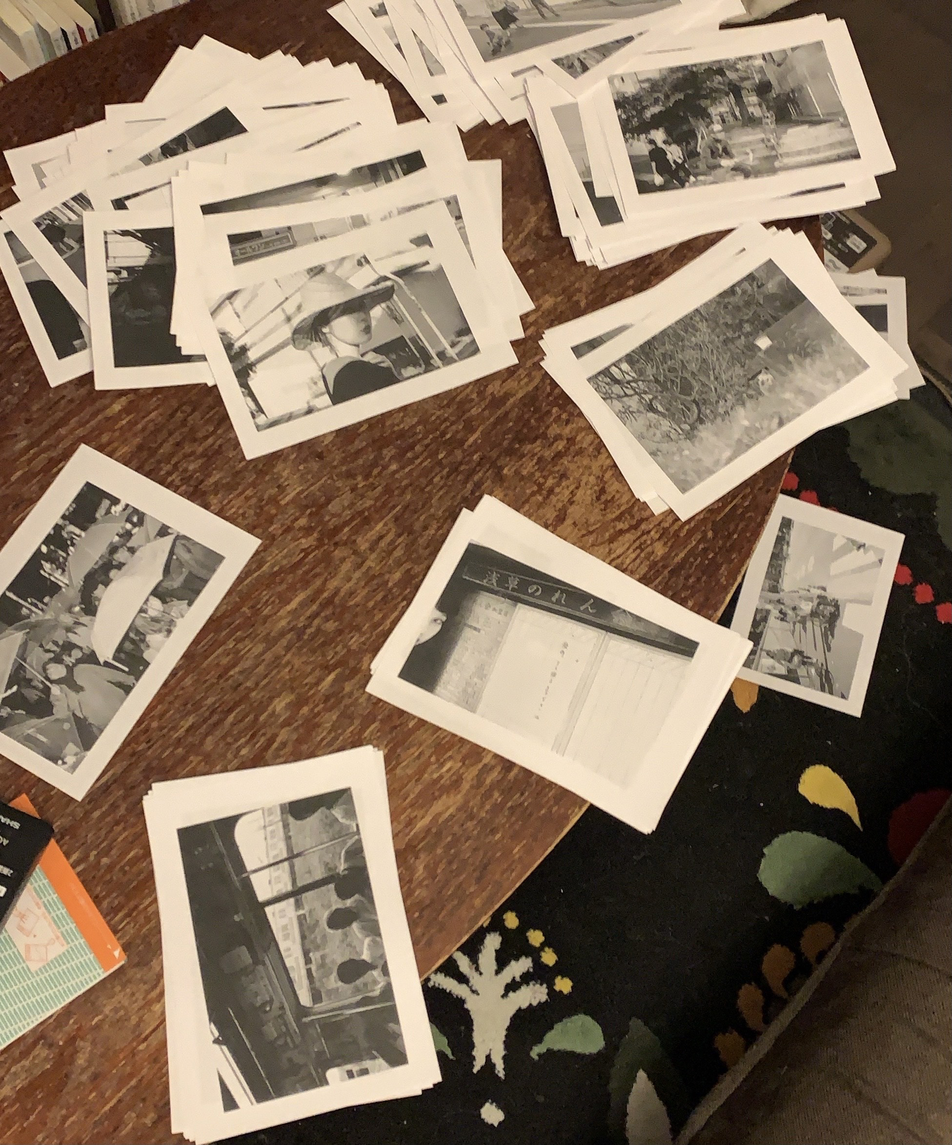
But before you can settle on a title, you need to have to have photographs. Thankfully, as a consistent darkroomer with thousands of silver prints stacked in boxes in my apartment, finding material was, aside from choosing the book cover color, the easiest part of the project. The difficult part of this easy part was, well, having thousands of prints to look though. I tend to edit as I photograph- quickly, and on intuition. The only rules I had were not to include any images from Zuisha, nothing indoors, or too “diaristic”, and to try and include as much new (post-Zuisha) work as possible. I sat on the floor and went through each box at least twice. The stack of pictures that made it through this rubric came out to about 250 prints. These I felt were headed in the direction the project was leading me.
When holding a photobook it’s tempting to imagine that each image is the result of the a photographer spending hours inspecting each and every last negative frame with smoldering determination. Maybe for some, it is. But in my case, thinking that 250 weren’t enough, I squeezed in more two darkroom sessions before the first layout deadline.
By then I had about 300 prints. Next stop, 7-11.
Each 7-11 convenience store in Japan has a feature-laden photocopier kiosk, and for ten yen a page they produce copies of enough quality to edit a book with. I made mine as 50% reductions. Rather than starting with digital files, I wanted to explore ways to put the pictures together on paper, page by page, as a loose book.
Personally, editing isn’t something I fret over much- at least in the short term. In my case, the my two-week Zuisha exhibitions which I hold are lots of little short-terms strung along the same three walls over the years. But a book isn’t a show- and pages aren’t walls. Books are a commitment- both to one’s creative vision but also (and more importantly) to money and paper. You want to make something worthwhile within the constrictions you’re granted. The paper approach worked as a beginning, but to make editing a bit easier- and hopefully better- I realized needed all potential images for the book as low-res scans. So, with an 11x14 box print under my arm each time I made a few trips back to my local 7-11. (Scans are 30 yen each). Each time I visited, and for the entire time I was there, an easy-listening instrumental version of Little Mermaid theme played on a loop. Once I saved all my scans to a USB drive I quickly headed home to clean out my ears with actual good music and sent the fresh jpeg files en masse, unedited to the design team.
That’s right- the initial edit was left entirely to the Mitsuhiro Kakinuma and Bonnie, of Zen Foto Gallery. She helps coordinate and edit and publishe books at Zen Foto. We decided not to show them my paper book dummy, so that their edit would be something new to me.
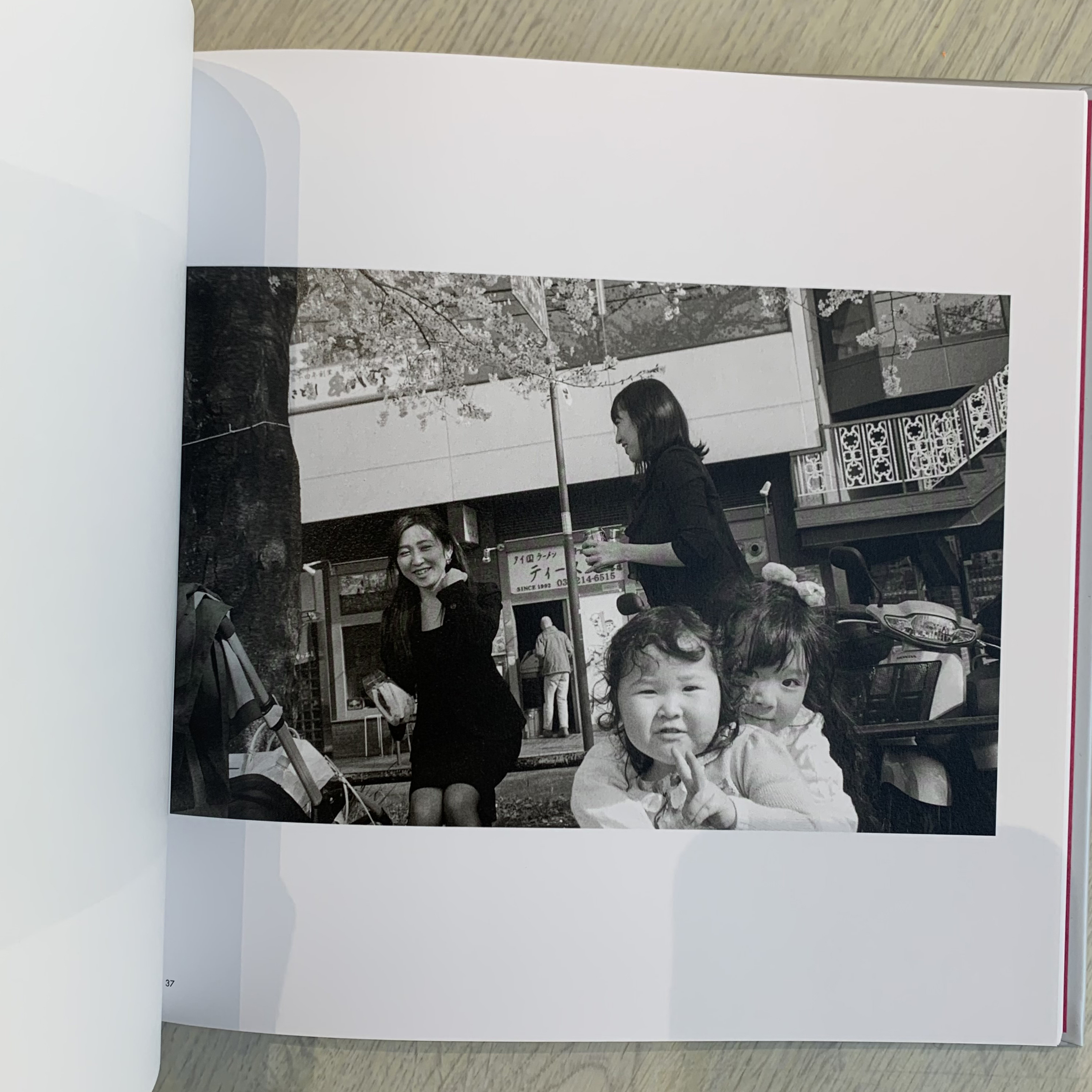
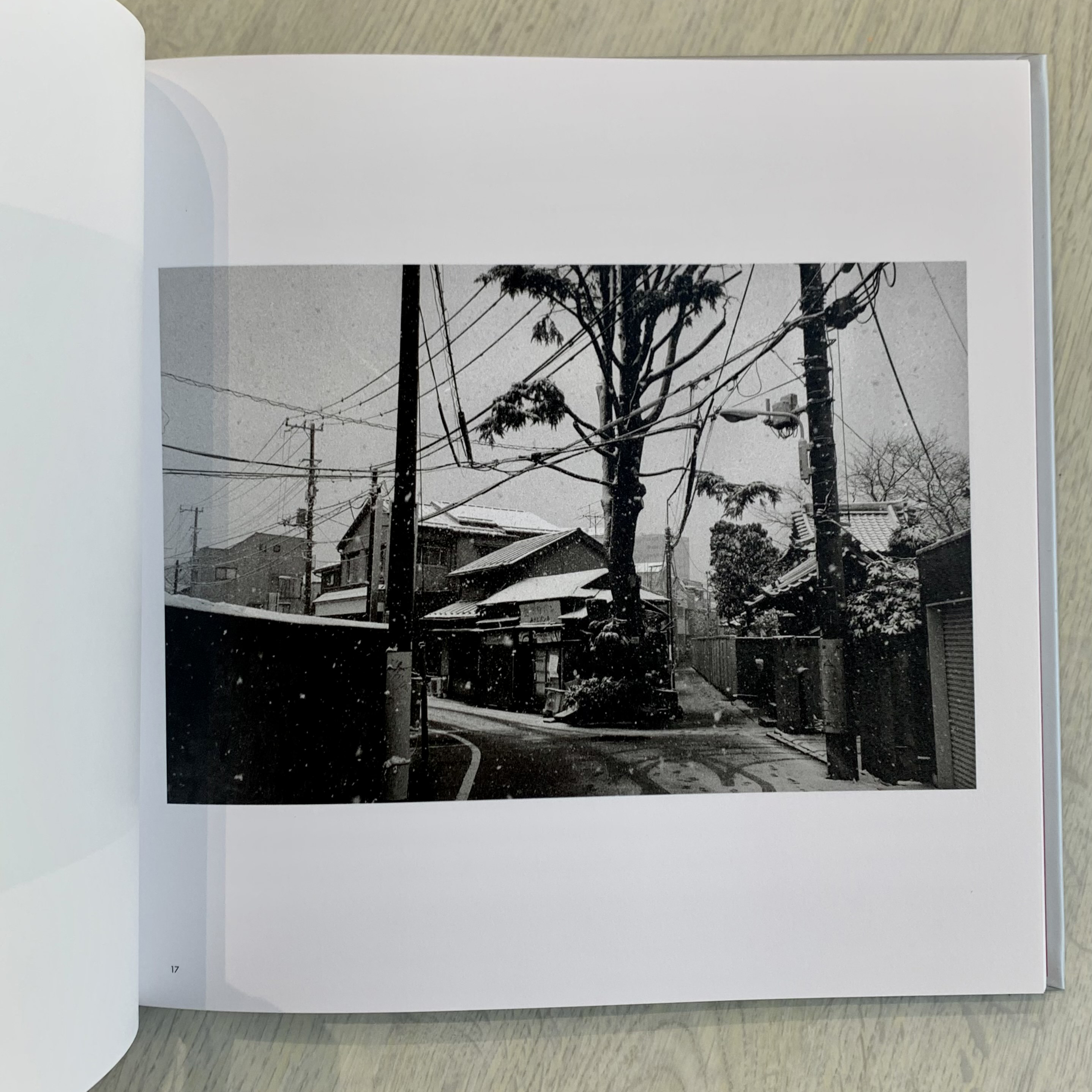
Now, I completely understand why a photographer would want full control over their book but in this case, I enjoyed seeing what two other people so well-versed in photography and publishing might discover in my pictures. The only think I asked was, as with Zuisha’s flow, that the pictures make sense seasonally. A close read of it reveals the progression of the year from autumn, winter, spring, summer, and autumn again.
A few days and a lot of consideration later, they sent me a PDF of their sequence.
With a bit of nervous curiosity, I opened the PDF on my laptop and started to click through the images.
Of course, there were plenty of parings which I had never thought of trying- some which were striking- and some which I was not particularly interested in. After a few look-throughs I switched some things around, tossed a few more pictures in, and sent it back. This is how the process continued- they’d review my edit, make notes, ask a few questions, offer advice (less cats), and send it back to me. Even though I may have sighed a little too loudly as I took out most of the cat photos I had quietly re-inserted, this give and take was enjoyable. Total Creative Control sounds nice but this experience was a way to learn more about photography, too. Being taught things about your own photos with your own photos is a precious experience. The collaboration is exciting, too.
Soon, the book really began to take its final form, revealing itself through our efforts. Gone were the more personal “diary” pictures (and a lot of cats) and here a proper, yet still-untitled Tokyo Book appeared.
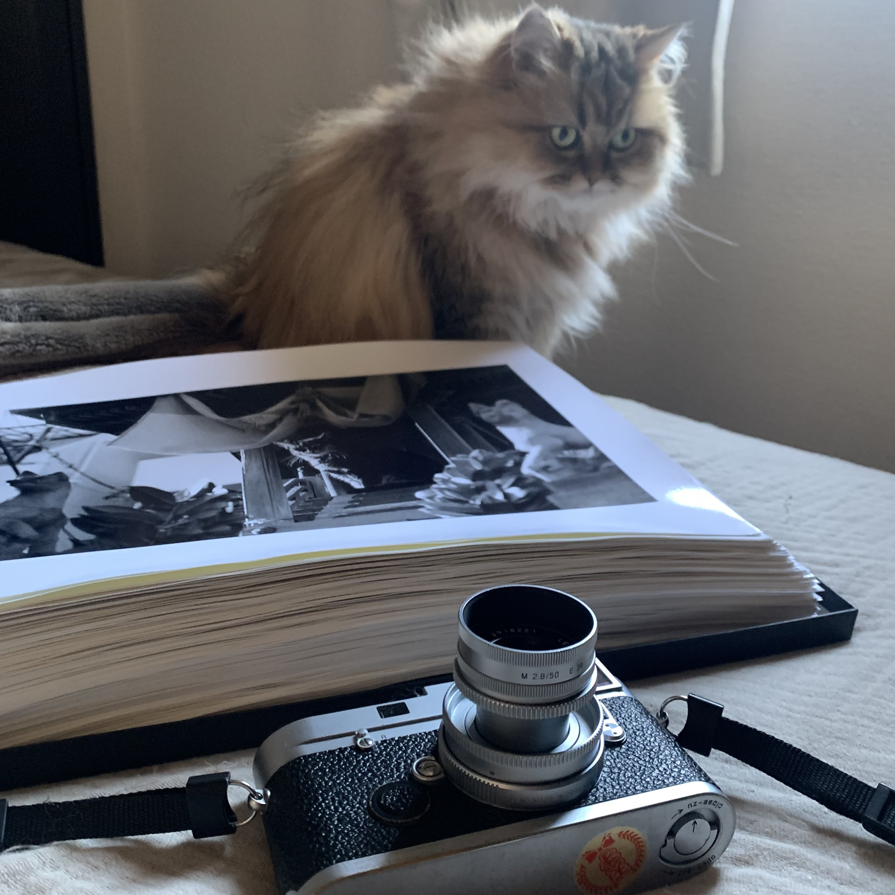
A few days later the three of us met a café under the gallery to work out the final selection and sequence in person. After agreeing on the final flow, Bonnie sent the PDF off to Mark, the publisher, for his final approval. Once it was received, I went back to my print boxes and pulled the prints to be scanned by the publisher. Just like with my Zuisha book, we used my actual prints as base for the book’s reproductions. To my mind the print, a physical product of effort and time and process, is a better than a straight negative scan since they contain the particular and original tonal information which I kneaded into them in the darkroom. I say that, but I’ve never done a book from negative scans and from what I’ve seen and known, I doubt anyone could tell a real difference.
So- here at this point the prints were off being prepared for publishing. Even though Bonnie was getting the print date set and paper stock ordered, the book still lacked a title.
Titling a body of work is for some reason one of the hardest things for me to do in creative work. Give me an 8-hour darkroom session any day. In my experience, the best titles, like a good creative moment- or good photograph- seem to appear when you’re ready, but didn’t know it yet. For some reason, and for a long, stressful week, I just wasn’t ready. Or perhaps had been thinking too much.
The same could be said for the book’s afterword- something which I knew I wanted to write, even though I didn’t know the words I needed, or the order to put them in.
7-11’s photocopier couldn’t help this time.
Upcoming in Part 2:
Printing and a title. Paradise discovered.
今週の東京フォトブックツアーは、いつもと少し違います。
いつも通りに「東京」から始まるタイトルの本を紹介しますが、今回の写真家は……私なのです。
2022年10月末、東京のZen Foto Galleryから私の最新写真集『銀園』(Tokyo Silver Paradise)が出版されました。今回のコラムでは、写真の内容や意味について語るよりも、この写真集ができるまでの体験談を少しお話ししたいと思います。暗室作業を除けば、構想から実際に本を手にするまでの期間は約3ヶ月。
その前に、少し過去を振り返ってみます。
Zen Foto Galleryは展覧会のほかに、アジアというテーマの写真を集めた、ユニークで美しい写真集を10年以上にわたってコツコツと出版しているギャラリーです。須田一政や倉田精二の名作はもちろん、Tokyo Rumandoや殿村任香といった若い女性たちのダイナミックな作品も生み出してきました。同様に、布張りでスリップケースに入った特大の写真集から、実験的でしばしば遊び心のある文庫本まで、大小さまざまなものがあります。
2017年の春、Zen Foto Galleyから、私のデビュー作『随想録』の出版を打診されました。 B5サイズのペーパーバックで、新宿のトーテムポールフォトギャラリーで同じタイトルで展示し現在も進行中の、数年にわたるシリーズ「随写」から編集された写真群です。オーナーのマーク・ピアソン氏は、招待を受ける以前から、しばしば時間を作って展覧会に足を運んでくださり、話をしていました。彼のサポートと励ましでその年の終わりに、私が誇りに思う本として実現し、今でもよく目を通しています。
2019年、Zen Fotoはこれまでコラボレーションしてきた写真家の作品を集めた新しいフォトブック・シリーズを開始しました。 統一されたデザインと表紙のカラーバリエーションは、1970年代の「朝日ソノラマ」27冊シリーズや1990年代後半の光琳社出版「Visions of Japan」シリーズなど、日本の古典的なフォトブック・コレクションを彷彿とさせるシリーズです。デザインは柿沼充弘によるもので、20×20cmの正方形のハードカバー、本棚から取り出して手に取るのにちょうどよい大きさです。縦長の写真も横長の写真も、正方形にすることで均等に配置することができます。

このシリーズは、須田一政の『現代東京図絵』から始まり、現在では14冊になりました。
上海や香港を取り上げたものもありますが、共通テーマとして「東京」が前面に出ているのが特徴です。実際、14冊のうち5冊はタイトルに「東京」が入っています(大西みつぐ氏の『路上の温度計 1997-2004』の書評はこちら)。
このシリーズに参加することになったとき、私もタイトルに「東京」を入れたいと思いました。でも、まずタイトルの前に写真を用意しなければなりません。ありがたいことに、何千枚もの銀塩プリントがアパートに積み上げられている暗室ユーザーの私にとって、素材を見つけることはこのプロジェクトで最も簡単なことでした。 簡単そうに見えるこの作業で難しいのは、何千枚ものプリントを見ることです。
人の写真集を手にすると、写真家はネガを一枚一枚時間をかけて吟味したのだと想像したくなります。
私はネガからではなく、プリントからセレクトを決めました。私は、写真を撮るように、素早く、直感的に編集する傾向があります。
今回課したルールは『随写』にある写真は入れないこと、室内で撮ったものや「日記的」なものは入れないこと、そしてできるだけ新しい作品を入れることでした。 私は床に座り、写真の入ったいくつもの箱を何度も見返しました。その結果約250枚の写真が集まりました。これらは、このプロジェクトが私を導いてくれる方向だと感じました。
しかし、私の場合250枚では足りないと思い、最初のレイアウトの締め切りまでに、さらに2回の暗室作業を行いました。その時には300枚くらいになっていました。次に向かったのは、セブンイレブンです。
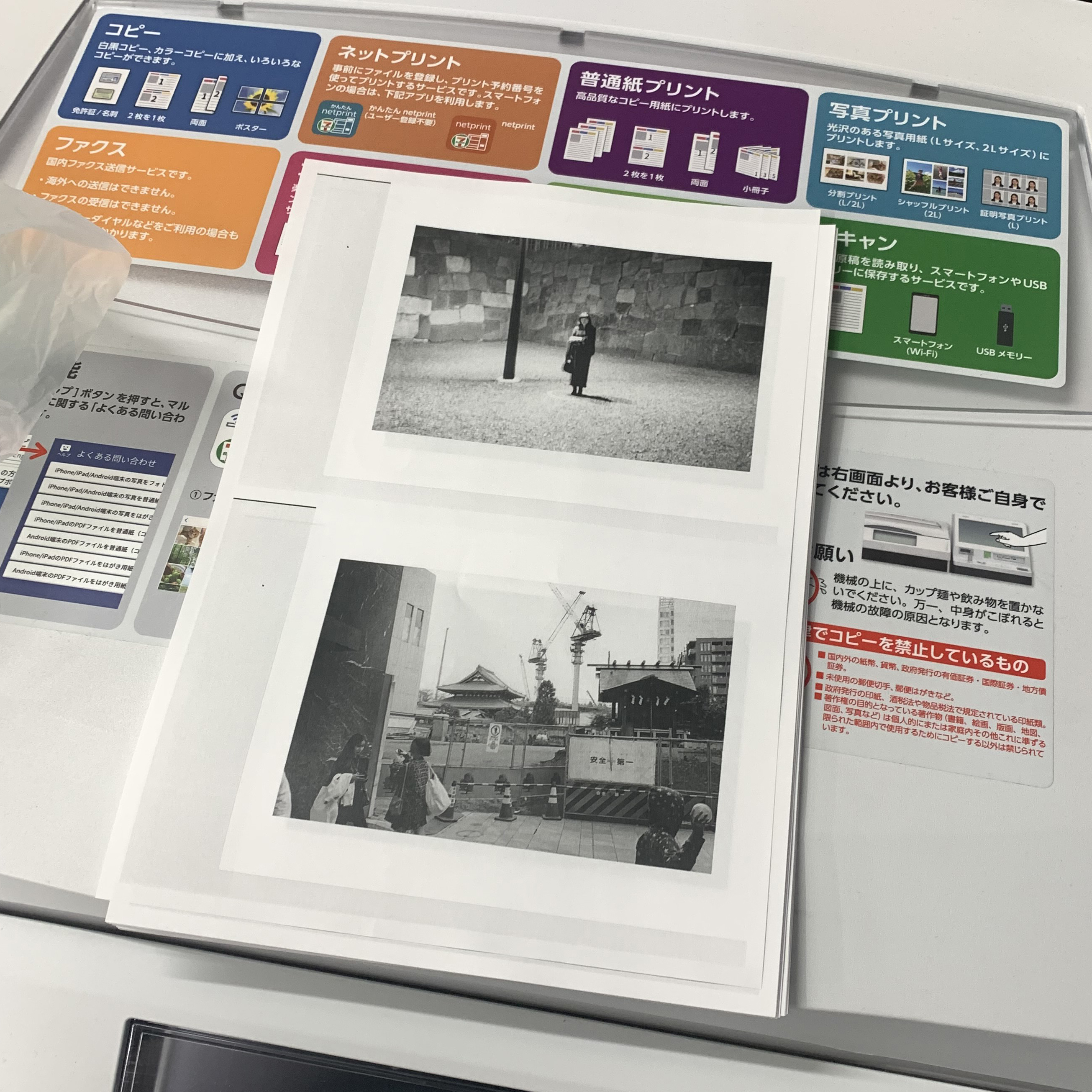
セブンイレブンのコピー機は、1枚10円で編集のために十分なクオリティのコピーができるんです。今回は50%縮小で作りました。紙の上に写真を1ページずつ並べて、ルーズブックにする方法を探したかったのです。
2週間かけて開催する展覧会の場合、何年もかけて積み重ねてきた経験に基づいてセレクトします。しかし、写真集と写真展ではまったく異なります。写真集とは、作家の創造的なビジョンと、そしてお金と紙に対するコミットです。与えられた制約の中で、価値あるものを作りたい。より良いものにするために、この写真集に掲載する写真はスキャン画像である必要があると考えました。
そこで、11x14のプリントが入ったボックスを手に、近所のセブンイレブンに何度か足を運びました(スキャンは1枚30円です)。その間ずっと『リトルマーメイド』のテーマ曲のインストバージョンが延々と流れていたのを覚えています…。
スキャンした画像をUSBメモリに保存したら、すぐに家に帰って良い音楽で耳を洗って、新鮮なjpegファイルをそのままデザインチームに一括送信しました。
本番の編集は、デザイナーの柿沼充弘さんとZen Foto GalleryのBonnieさんにすべてお任せしたのです。柿沼さんはコーディネートや編集、出版を手伝ってくれています。 私がつくったダミー本は見せないことにして、彼らの編集が新鮮なものになるよう努めました。
写真家が自分の写真集を完全にコントロールしたいと思う気持ちはわかりますが、今回は写真と出版に精通しているプロフェッショナルが、私の写真から何を発見するのかを見るのが楽しみだったのです。
ただひとつだけお願いしたのは、写真が季節ごとに意味をなしているかということです。よく見ると、秋・冬・春・夏、そしてまた秋と1年の流れがわかるのです。
数日後、いろいろと検討した結果、彼らのシークエンスのPDFが送られてきました。
ドキドキしながら、ノートパソコンでそのPDFを開き、その写真の流れを見ました。
もちろん、今まで試したことのないようなペアリングの写真もたくさんありましたし、印象的なものもあれば、特に興味のないものもありました。何度か見直した後、私はいくつかの部分を入れ替え、さらにいくつかの写真を放り込んで、送り返しました。こうして、私の編集を確認し、メモを取り、質問をし、アドバイス(「猫は少なくしてね」など)を送り返すというプロセスが続きました。
「トータル・クリエイティブ・コントロール」というと聞こえはいいですが、この体験は写真をより深く知るための方法でもありました。自分の写真に関することを教わることは貴重な体験です。
やがて、この写真集は、私たちの努力によって、最終的な形が見えてきました。 その時タイトルは未定でしたが、なんとなく「東京」という写真集が現れてきたのです。

数日後、ギャラリーの近くにあるカフェで3人と会って、最終的なセレクションとシークエンスを直に確認しました。 最終的な流れに合意したボニーさんは、マークさんにPDFを送り、最終的な承認をもらいました。 それが届くと、私はプリント箱から、出版社にスキャンしてもらうためにプリントを引っ張り出しました。 「随写」の本と同じように、この本の複製も私の実際のプリントをベースにしています。プリントは、暗室で練り上げたオリジナルの色調情報は、ネガをそのままスキャンするよりも、手間と時間をかけた物理的な産物であると私は考えています。とはいえ、私はネガスキャンから本を作ったことはありませんし、私が見て知っている限りでは、誰も本当の違いを見分けることはできないでしょう。
この時点で出版に向けた印刷準備は終わり。ボニーさんは印刷日を決め、紙を注文していましたが、本にはまだタイトルがありませんでした…やばい!
作品にタイトルをつけることは、クリエイティブな仕事をする上で、なぜか最も難しいのです。8時間の暗室作業のほうがまだいい…。
私の経験では、最高のタイトルは、素晴らしい瞬間への出会いと同じように、期待していないときにこそ現れるような気がします。それまでの1週間は考えすぎていたのかもしれません。
この本の後書きにも綴りましたが、書きたいとは思っていたものの、必要な言葉や順番が分からなかったのです。
来週は写真集『銀園』制作、第2回「印刷とタイトル、そして パラダイス発見!」。


〉26 Duets? Duels? Near-overlaps of time and Space across Tokyo. 東京の時間と空間が重なり合う写真集ツアー
2025/04/04
〉25 Naoki Ishikawa "TOKYO The City Where I Was Born" 石川直樹『東京 ぼくの生まれた街』
2024/01/05
〉24 山内道雄 Michio Yamauchi『TOKYO UP CLOSE』
2023/10/20
〉23 山崎茂 『浅草1974』Shigeru Yamazaki "Asakusa 1974"
2023/09/15
〉22 山崎弘義 Hiroyoshi Yamazaki『CROSSROAD』
2023/08/25
〉21 『東京』名取洋之助 編 "TOKYO" Edited by Yonosuke Natori
2023/07/22
〉20 鈴木 親『新東京』Chikashi Suzuki "SHINTOKYO (NEW TOKYO)"
2023/06/16
〉19 デイブ・ヘンドリー / Dave Hendley『Tokyo Photo Walk』
2023/05/19
〉18 特定の場所から見る東京2:不忍池・弁天島をめぐる写真集
2023/04/21
〉17 特定の場所から見る東京:皇居の東側に架かる「二重橋」をめぐる写真集たち
2023/03/24
2023/02/25
〉15 荒木経惟・飯田鉄・高梨豊『私だけの東京散歩』〈下町・都心篇〉〈山の手・郊外篇〉
2023/01/27
2022/12/23
2022/11/25
2022/10/28
2022/09/23
〉10 岡本正史『Tokyo Summer 2020』&『Everyday Tokyo 2021』
2022/08/26
2022/07/29
2022/07/01
2022/06/03
2022/05/06
2022/04/08
〉4 雑誌『写真』Sha Shin Magazine vol.1
2022/03/11
2022/02/11
2022/01/14
2021/12/10
 26 Duets? Duels? Near-overlaps of time and Space across Tokyo. 東京の時間と空間が重なり合う写真集ツアー
2025/04/04
26 Duets? Duels? Near-overlaps of time and Space across Tokyo. 東京の時間と空間が重なり合う写真集ツアー
2025/04/04
 25 Naoki Ishikawa "TOKYO The City Where I Was Born" 石川直樹『東京 ぼくの生まれた街』
2024/01/05
25 Naoki Ishikawa "TOKYO The City Where I Was Born" 石川直樹『東京 ぼくの生まれた街』
2024/01/05
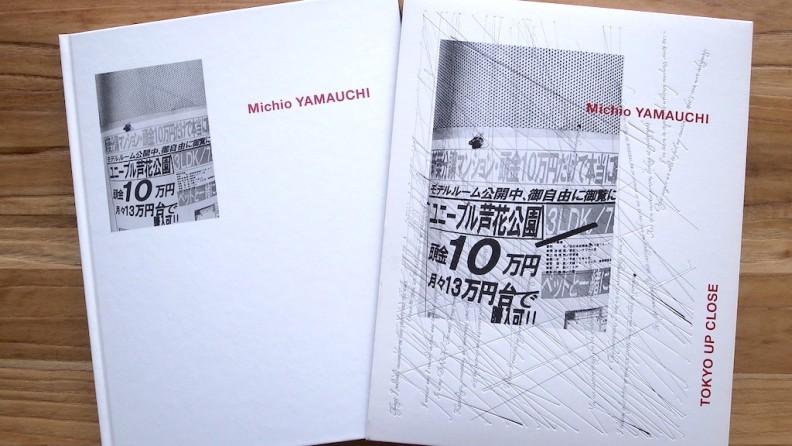 24 山内道雄 Michio Yamauchi『TOKYO UP CLOSE』
2023/10/20
24 山内道雄 Michio Yamauchi『TOKYO UP CLOSE』
2023/10/20


PCT Membersは、Photo & Culture, Tokyoのウェブ会員制度です。
ご登録いただくと、最新の記事更新情報・ニュースをメールマガジンでお届け、また会員限定の読者プレゼントなども実施します。
今後はさらにサービスの拡充をはかり、より魅力的でお得な内容をご提供していく予定です。
 「Photo & Culture, Tokyo」最新の更新情報や、ニュースなどをお届けメールマガジンのお届け
 書籍、写真グッズなど会員限定の読者プレゼントを実施会員限定プレゼント